I Hacked an ECG Machine

Audio, Data Analysis, Medical, Projects

Abstract

This project explores a method to extract and decode high-quality ECG data from the KardiaMobile device without relying on proprietary APIs. By leveraging the original device’s frequency-modulated (FM) audio output, I developed a pipeline for demodulating, calibrating, and denoising the signal using quadrature demodulation and adaptive filtering techniques. The approach successfully removes noise, including mains hum and harmonics, and reconstructs the ECG signal with high fidelity. This method successfully produced high-quality ECG signals, clearly showing key features such as the P-waves, the QRS-complex, and T-waves. This accessible and cost-effective solution enables incidental ECG data collection for research purposes, using the KardiaMobile’s affordable hardware.

Introduction

I’ve been interested in electrocardiograms (ECG or EKG) for several years. Back in 2017, I attempted to build my own ECG machine. While the project didn’t progress very far (resulting in a few damaged operational amplifiers), it sparked a lasting fascination with ECG technology.

This interest resurfaced when I discovered the KardiaMobile ECG devices. These pocket-sized, battery-powered machines connect to a smartphone and enable basic ECG recordings. They are approved by both the British National Institute for Health and Care Excellence (NICE) and the U.S. Food and Drug Administration (FDA). The KardiaMobile 6L even records three channels, allowing for six-lead ECGs to be synthesized. This elegant, pre-packaged solution immediately reminded me of my earlier ECG project—only someone else had done all the hard work.

The KardiaMobile is a compact device, approximately 80 mm long and 30 mm wide, with two metal electrodes for recording ECGs. It outputs the ECG signal which is then picked up by the smartphone app that seems to work on almost any phone with recordings limited to 5 minutes by the Kardia app. To record an ECG you start up the app and set it to record an ECG then place your left index finger on the left electrode and your right index finger on the right electrode. The app then detects that an ECG is now being generated and starts recording it, plotting it live on the screen. After the ECG has been acquired you can then save the ECG in the app along with tags and notes and you can also generate PDF reports that plot the ECG on a page along with basic information.

The app can even detect a few heart conditions – although it’s no substitute for a cardiologist.

While KardiaMobile devices work seamlessly with the official Kardia app to generate ECG plots and reports, my interest lay elsewhere: I wanted access to the raw ECG data to create custom visualizations and analyses. My goal wasn’t related to health monitoring or diagnosis; I simply wanted to explore the data and create neat charts.

The Problem: How to access the data?

The KardiaMobile 6L transmits ECG data to a smartphone via Bluetooth, a secure two-way protocol with encryption and numerous parameters. Extracting raw data directly seemed like a dead end. I briefly considered tracing ECG plots from the app’s reports, but having tried similar methods before, I knew how error-prone they could be. Kardia does offer an API, but it appears to be intended for clinical use, not individual hobbyists—they never responded to my inquiries.

Chance solution: The older version uses sound waves to transmit the data

By chance, I watched a cardiologist’s review of the KardiaMobile on YouTube. He mentioned that the device uses sound waves to communicate with the app. While this seemed preposterous, I decided to investigate. To my surprise, I discovered that the original KardiaMobile (single-lead) indeed transmits its signal using a frequency-modulated (FM) sound wave in the 18–20 kHz range, as specified in its documentation. The key details include:

  • A carrier frequency of 19 kHz
  • Frequency modulation with a scale of 200 Hz/mV
  • A 10 mV peak-to-peak range
  • A frequency response from 0.1 Hz to 40 Hz

Armed with this information, I mocked up a test: I generated a synthetic heartbeat, frequency-modulated it, and played it through my computer. To my amazement, the Kardia app detected it as a healthy heartbeat with a BPM of 75—precisely what I had set. Confident in my understanding of the encoding process, I purchased a KardiaMobile device to explore further.

I actually found out all of this information before purchasing an ECG machine. So I mocked up an example heartbeat, frequency modulated it and played it on my computer. The Kardia app detected it as a healthy heartbeat with a BPM of 75, exactly what I had set it as. At this point, I was pretty sure that I understood the encoding process since I had effectively reverse-engineered the protocol and had a successful test on the Kardia app. The output is one-way, analogue, and not encrypted. With this newfound confidence in my plan, I bought a KardiaMobile ECG.

Optimising the signal acquisition

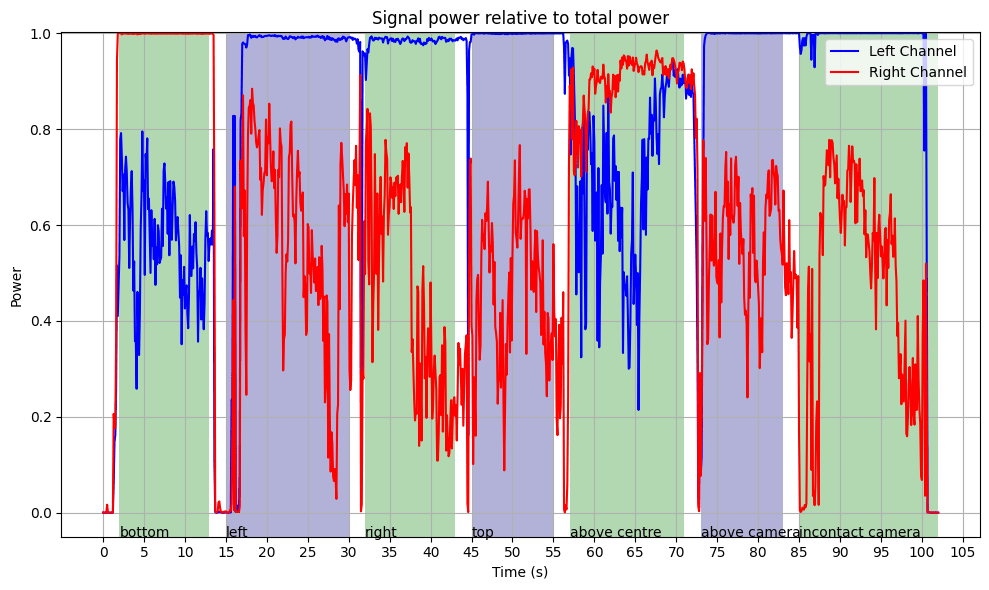
While initially concerned about microphone selection, I found that the microphones on my Samsung Galaxy S20 Ultra worked well—FM modulation is forgiving. I also experimented with beamforming algorithms to improve signal-to-noise ratio (SNR), but they failed due to the directional nature of the high-frequency signal. A simpler method, selecting the channel with the most power in the carrier band, proved effective. This shouldn’t have been surprising as the app also works by using the built-in microphone on my phone, however initially I wasn’t sure how much signal processing they were doing so I wanted to get the best initial signal.

Amount of signal in carrier band received by each microphone on my phone

After I did a quick experiment where I held the Kardiamobile near my phone in different places I was able to work out where the best place to hold it was. I ended up using the bottom of the phone for all of my tests as it yielded high signal and was convenient.

Decoding the ECG Signal

The decoding process follows these steps:

  1. Input and Preprocessing:
    • Read the audio file and determine its sample rate.
    • If the signal has multiple channels, select the one with the highest power in the carrier band.
  2. FM Demodulation:
    • I tested several demodulation methods, with quadrature demodulation yielding acceptable results with a simple algorithm. This calculates the frequency deviation from the carrier frequency.
  3. Calibration and Downsampling:
    • Convert the frequency deviations to voltage using the scale of 200 Hz/mV.
    • Downsample the signal to 600 samples/second, as the 19 kHz carrier signal has been removed so high temporal resolution isn’t needed.
  4. Denoising and Filtering:
    • Identify and filter out mains hum (e.g., 50 Hz in the UK, including harmonics). I implemented an adaptive Fourier-based filter to detect and remove the specific mains frequency and its harmonics.
    • Remove low-frequency noise (<0.52 Hz) and high-frequency noise (>40 Hz) using a zero-phase filter to avoid adding in phase distortion to the signal.
  5. Post-Processing:
    • Apply wavelet denoising using DB4 wavelets to remove noise without reducing the sharp features in the signal.
    • Trim extraneous noise at the start and end of the recording.

Removing mains hum

The main source of noise was mains hum picked up by the Kardia ECG itself. An example of the filtering process is shown below, where the sharp peak near 50 Hz. I used an adaptive filtering approach that ensures precise removal even when the mains frequency slightly deviates (e.g., 49.92 Hz instead of 50 Hz) removing the minimum additional signal.

Detected Mains Frequency: 49.92 Hz
Filtering 49.92 Hz: Range [49.42, 50.42]
Filtering 99.84 Hz: Range [98.85, 100.84]
Filtering 149.77 Hz: Range [148.27, 151.26]
Filtering 199.69 Hz: Range [197.69, 201.69]
Filtering 249.61 Hz: Range [247.11, 252.11]
Effect of filtering out mains hum in the frequency domain and the time domain. The bottom plots are zoomed-in sections.

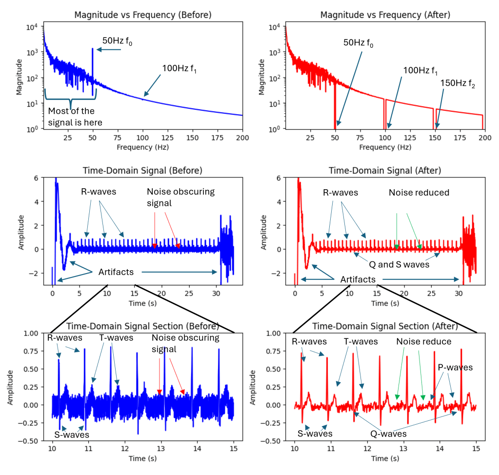
Since the mains frequency component is so strong the filtering process also needs to be very strong. A second-order filter with a cut-off frequency of 40Hz still left a large amount of 50Hz noise in the signal. Interestingly this 50Hz hum is not hum picked up by the microphone it’s actually hum picked up inside the Kardia unit. I used second-order zero-phase filters that avoid adding phase artifacts to the signal. Traditional filters like Butterworth filters add a phase shift that varies by frequency which can be particularly harmful to these kinds of signals.

Following this additional denoising was applied using wavelet transforms and Daubechies 4 (DB4) wavelets. This transforms the time domain signal into a signal that is made up of short bursts of short packets of waves. These efficiently model bursty signals like heartbeats and poorly model totally random signals like noise. In the wavelet domain, you can filter out small wavelet coefficients that are more likely to correspond to noise and keep coefficients of greater magnitude that are more likely to correspond to my heartbeat signal.

I then added some basic signal processing was used to estimate where the real signal started and finished (i.e., to remove the initial and final bits of noise from when Kardia unit was off).

Results

After all of these steps, I was able to produce high-quality ECG results that can be exported in any output format (.csv, .xls, .npy, .mat etc) and plotted in any way desired. Kardia likely adds lots of useful signal processing that I’m not able to reproduce at this time however I was able to produce ECG results that clearly show the main features of the expected heartbeat signal including R-waves, T-waves, S-waves, and the QRS complex.

Full signal after decoding and denoising
Signal section showing: P, QRS, and T waves

Conclusion

The result of all this is a high-quality method of recording and exporting ECG data from the Kardiamobile device without using their API which is not available to the general public. Since the Kardia device is very inexpensive – I paid around £50 (60USD or 60EURO) for mine – and this method is easy to reproduce this may open up new avenues for incidental ECG usage in a research setting. This may enable researchers to extract ECG signals from inexpensive hardware, facilitating incidental ECG usage in various research settings.

This method is obviously not appropriate for monitoring or diagnosing any kind of health condition.

An extremely rough version of this code is available at my github: https://github.com/joshuamcateer/kardiadecode

Quick Peek: Demodulating FM Sound Signals in a Noisy Environment

Audio, Data Analysis, Quick Peeks

Premature optimisation is a trap you can easily fall into whenever you are making or designing something. In some ways, it feels wrong to do something badly when you know you could do it better with a little more time. However, it is almost always best to get something working (even if it’s not perfect) rather than striving for an elegant solution that doesn’t yet work. You can always implement the faster, more accurate, or more elegant method later—and often you don’t need to. It is also far easier to improve something that already works than to build something from scratch.

Over the last few days, I have been working on a project that involves decoding a high-frequency, frequency-modulated (FM) audio signal. I recorded this signal on my phone, which has stereo microphones, and spent some time writing a clever beam-forming algorithm that adjusts the amplitude and phase of the signals received by the two microphones to increase the FM signal strength while rejecting background noise. The algorithm used simulated annealing to optimise the amplitude and phase adjustments, and it worked very well in a set of simulated examples that I used for testing.

However, it did not work well on the actual data I collected. I spent quite a while fixing and tuning parameters but could not get it to perform properly. Eventually, I did what I should have done from the beginning: I conducted a real experiment and carried out some simple data analysis to understand what was happening.

I moved the source around different parts of my phone and plotted the power in the FM carrier band. After looking at the plot, it became immediately obvious why the beam-forming algorithm never worked: the sound was far too directional. (This makes complete sense, given that it was a high-frequency sound.) There was never a point where the sound was picked up strongly by both microphones; it was only ever picked up by one at a time. I should have used a much simpler approach: just take the output from whichever channel had the highest power in the carrier band—a single line of code—rather than hundreds.

In fact, the plot of the ratio of signal power to total power implies that in this example, the signal typically makes up the vast majority of the received power. However, the carrier band power is only a proxy for the actual signal, since it also includes FM-encoded noise that is not truly signal. Therefore, the true ratio of signal power to total power is somewhat lower.

Zeiss Tessar: How does my vintage lens blur images?

Computer Vision, Optics, Photography, Projects

Modern camera lenses are typically super sharp but can sometimes lack character. Vintage lenses with fewer corrective elements are typically softer and have decreasing contrast and resolution in the corners. But what’s going on in my lens?

In this post, I’ll use computer vision techniques to analyse the performance of this vintage lens and then see what effect this has on photographs.

Background

The lens was a budget product from one of the premier optical manufacturers in the world, Zeiss. Zeiss has long been synonymous with excellent optics, developing many key technologies in its history. Currently, Zeiss produces extremely high-performance optics for a range of applications, including photography and photolithography – the silicon chips in your laptop and iPhone were likely manufactured using Zeiss-made photolithography systems. After the partition of Germany, Zeiss – a high-tech company critical to modern economies and militaries – was also partitioned. Much of the stock, equipment, intellectual property, and staff were taken by the Soviet Union to kick-start its optics industry and the remaining Zeiss company was split into Zeiss Oberkochen in West Germany that largely sold to the West, and Carl Zeiss Jena in East Germany that largely sold to the Soviet Union.

This lens was manufactured in 1967 by Carl Zeiss Jena and is a Zeiss Tessar design. The original Tessar was patented in 1902 which I have previously discussed, but this one was redesigned for smaller formats using the latest glasses and design techniques. It was sometimes called the eagle eye because of its centre sharpness and contrast. This is a 4 element/3 group design that performed well, especially when coating technology was in its infancy when it was important to minimise the number of glass-air interfaces to reduce flaring. This example is single-coated, has a minimum focus distance of 0.35m, uses unit focusing (the whole optical unit moves back and forth to focus), and was designed for use with 135 (35mm) film probably for colour and black and white – which were both available when this lens was manufactured. Films available in 1967 were very different to the ones available now and in the ’90s. They were slower and had more grain, Kodachrome II (I believe the most common colour film available in 1967) was available in ASA 25 and Kodachrome-X had just been released in 1962 with a speed of ASA 64. ASA speed is basically the same as ISO speed – in fact, ASA and ISO are just standard agencies (American Standards Agency and ISO kind of means International Standards Organisation, although it now isn’t an acronym and is just ISO, the Greek prefix for same) which specify how the film speed should be measured, there are ISO standards for bolts, paper sizes, and almost anything else you can think of (including how to make a cup of tea).

The lens has a five-bladed aperture, aperture clicks from f/2.8-f/22 with half stops. It has a depth of field scale, infrared focus mark, and an automatic aperture system – meaning that, on a compatible SLR, the aperture remains open for focusing and then stops down the specified setting when the shutter is depressed. It uses the M42 mount which is easily adapted to other systems due to its long back focal distance. The lens body is made of aluminium and has an attractive brushed/striped design that offers excellent grip. This particular lens had a stuck focusing helicoid, so I removed the old grease using lighter fluid, lint-free paper, and cotton buds and re-greased it with modern molybdenum grease (Liqui Moly LM47).

I wrote some software (this actually took ages) and printed off some test charts to work out exactly what my vintage Zeiss Tessar 50mm 2.8 lens is doing to my images.

Analysing the Blurring

I photographed the test charts at a set distance (0.6m) wide open (f/2.8) and stopped down (f/8). The camera was set on a stable tripod and carefully aligned so that it was perpendicular to the floor where the test chart was placed a 10-second shutter delay was used to reduce camera shake and the camera was set at its base sensitivity to minimise noise.

The software that I wrote found each of the test targets in the stopped-down image and found the corresponding test targets in the wide-open image, this is shown in Figure 0. I then assumed that the stopped-down image was perfect and used it as a reference to compare the wide-open image.

Figure 0. Computer vision algorithm automatically finds the targets in the test chart.

Using some fancy maths (called a Fourier transform) you can work out how to transform between the sharp stopped-down image and the blurred wide-open image. I did this for each target on my test chart because the amount and nature of the blurring are different across the frame.

Fig 1. Reference test chart taken at f/8 with centre and edge targets marked. The edge targets are less sharp than the centre even in the reference image.
Fig 2. Wide open test chart taken at f/2.8 with centre and edge targets marked

The above images are the photographs of the test charts photographed at the sharp aperture (f/8) and the blurred aperture (f/2.8). This method of using the sharpest aperture of the lens as the reference was used because it allows for perfect alignment of the images – both images have the same geometric distortion. A limitation of this method can be seen in Figure 1 in which the corners of the image are not perfectly sharp even at f/8. I was inspired to use this method after reading the excellent paper High-Quality Computational Imaging Through Simple Lenses by Heide et al, 2013, although the actual method that I used was different.

Fig 3. Comparison of reference and wide open targets. The central targets are slightly blurred and the edge targets are very blurred.

Enlarged examples of the test target pairs are shown in Figure 3. I then worked out exactly what blurring function you need to apply to the sharp image to produce the blurred image for each pair of targets. The result of this is shown in Figure 4, which is an array of point spread functions (PSFs). These PSFs show how each point in the image is blurred by the lens – the PSFs in Figure 4 are zoomed in 7x. Figure 4 also includes a second array of targets that is offset from the one shown in Figures 1 and 2, that’s why the PSFs are arranged in two grid patterns. The results from the two test charts agree.

Figure 4. Point spread functions at different locations over the frame. Zoomed in 7x
Figure 5. PSF from the centre of the frame. The PSF is compact with a halo around it that is mostly symmetrical. Left is the original and the right panel has increased contrast.
Figure 6. PSF from the centre of the frame. The PSF has a core and a surrounding extended diagonal line. Left is the original and the right panel has increased contrast.

Figures 5 and 6 show enlarged PSFs from Figure 4. The nature of the PSF changes over the image. The PSFs in the centre are more compact and have a distinct halo around the central region, an ideal PSF would have a central point and no surrounding detail. The halo around the points is spherical aberration, this is an optical aberration caused when rays parallel to the optical axis of the lens are focused at different distances from the lens depending on the distance from the optical axis. This causes a glowing effect in the image, since a sharp image is formed (the sharp central core of the PSF) and a blurred image of the same object is also formed but superimposed on the sharp image. This would not greatly reduce resolution but would reduce contrast. Spherical aberration should be constant over the image frame, but varies a lot with the aperture size used in the lens, stopping the lens down reduces spherical aberration quickly.

The PSF in Figure 6 mostly shows sagittal astigmatism. Astigmatism is when rays in two perpendicular planes have different focal points. Two kinds of astigmatism that occur in systems like this are tangential astigmatism and sagittal astigmatism. Tangential astigmatism points towards the optical centre of the frame and sagittal astigmatism points perpendicular to the centre of the frame. Sagittal astigmatism can cause a swirly effect in images as it blurs points into circular arcs around the optical centre. A lens with sagittal astigmatism can be refocused to give tangential astigmatism so the orientation of the astigmatism will flip around. This is because the best sagittal focus and the best tangential focus occur in different planes. Astigmatism doesn’t occur in the centre of the frame and increases rapidly towards the edge of the frame and with increasing aperture size. This aberration is sometimes called coma which is a similar but distinct aberration that looks a bit like a comet with a sharp point pointing towards the centre of the image and a fatter tail pointing away.

Above are maps of the Strehl ratio of the PSF. Strehl ratio is a simple measure of PSF quality, where higher values (maximum 1) indicate that the PSF is most similar to an ideal PSF e.g., a single point in this case. The bright greens are the regions of highest sharpness and the dark blues are the regions of lower sharpness. There is likely some noise in this estimate – I don’t completely trust it. However, from this analysis, it seems that the lens is somewhat decentred, as the sharpest region of the lens is not in the direct centre. This could be due to manufacturing defects such as the lens elements not being correctly seated, or due to damage that occurred during the previous 57 years, or due to an alignment issue with the lens adapter or the target was photographed.

An interesting feature of this lens is the apparent lack of axial chromatic aberration. The PSFs are very similar in each colour channel and the Strehl maps are also very similar, these tests are not very demanding and are not able to test at all for transverse chromatic aberration. For a lens likely designed with black and white photography in mind this is a pleasant supprise.

Example Images

Below are sample images taken with the lens at various apertures, mostly f2.8 (wide-open) and f/8. The second gallery includes zoomed-in regions to show the character of the lens in more detail. Simple colour and exposure correction was applied in Adobe Lightroom, no texture, clarity, or dehazing was added. Images were resized to 1600px on the long edge with sharpening for screen added at export.

A selected sample of images with zoomed-in regions. The image with daisies shows much greater sharpness in the centre of the image compared with the edge and some swirling effect caused by the astigmatism in the lens. The pair of images of the graffiti rabbit (f/2.8 and f/8) show the increase in contrast and sharpness as the lens is stopped down. All areas of the image show an improvement in sharpness and contrast, but the edges improve more. This is also shown in the pair of leaf images, however, the increase in depth of field in these images makes it harder to determine sharpness changes in the plane of focus. The train track images show the same trend with a distinct increase in contrast in the centre of the image (the clocktower).

The bokeh image is of running water in a canal and was taken with the lens set to close focus at f/2.8. The bokeh is bubbly with distinct outer highlights which indicates over-corrected spherical aberration, sometimes this is considered attractive such as in the Meyer Optik Goerlitz Trioplan lens, however, the effect is less strong in this Tessar. This also leads to the distracting out-of-focus elements in the last image of the dog (my beagle, Saturn) where a line out of the plane of focus is blurred into a sharply defined feature.

None of these images show chromatic aberration, this would likely be apparent on the image of the tram powerlines.

Conclusion

Despite the lens being 57 years old it is still capable of producing sharp images. The lens is sharper in the centre of the frame than at the edge and the edge has a small amount of swirl effect. The lens doesn’t offer much ‘character’, which is likely expected as it was a standard lens for decades and most people want low-cost, small, sharp-enough lenses that don’t detract from the subjects being photographed. There some pleasant aspects of the lens, such as the slightly soft look that may be pleasing for some portrait work, and the bubbly bokeh may be desirable for some creative effects.

To get the most character from this lens, have a bit of separation between the subject and the background and foreground elements. Strong highlights may have a distracting or exciting bubbly effect, so stay cognisant of this. The lens has a great minimum focusing distance and so can produce quite a lot of out-of-focus blurring, it’s also a bit softer up close, so use this when you want to knock out very sharp details, such as skin texture in portraits. The lens has little chromatic aberration so don’t worry too much about that. The vibes of the lens tie the image together nicely, although they make it a little flat before contrast is added back in editing.

Macro photos April 2024

Photography

These images were shot in my garden at low magnification using my new Laowa 90mm macro lens. It’s a great lens, apochromatically corrected, super sharp, and with up to 2x reproduction ratio. Here are a few images I captured using it.

These images were single exposures taken with a diffused flash. The diffused flash yields rich warm colours when the white balance is set correctly. It also avoids obvious specular highlights and increases sharpness. It isn’t always the best choice for macro photography, but I do enjoy the depth caused by the light fall off.

DIY wall-reflecting surround sound speakers

Audio, Projects

Surround sound is cool. Hearing sound effects and music coming from every angle is much more immersive than just having the sound come from your TV. However, it isn’t easy to fit so many speakers in to every type of room. People who are into hi-fi will tell you that you need to have your speakers a specific distance from the wall, and rotate them at a specific angle to get the best sonic experience in the seating position. And god forbid if you tell them that you have your sofa against the back wall… “The rear wall will enhance the bass at random frequencies, it will sound boomy and horrible”.

What do you do then, if your room isn’t the right size and shape for an ideal home cinema? What if you only have space to put a speaker on one side of the seats? Well, one thing you probably shouldn’t do is build the speakers yourself (but maybe you still should).

The room problem. A small side table on one side and the doorway on the other. No room for a speaker on the right hand side.

I wanted to install a 5.1 surround sound system, starting with a 3.0 system. If you didn’t know, the first number is the number of ‘surround speaker’, and the second number is the number of subwoofers. Typically in cinemas sounds bellow around 80Hz are played by subwoofers, and higher frequencies are played by the other speakers. 3.1 systems have a left and right speaker, and a centre channel as well as a subwoofer (the 0.1). 5.1 systems add two surround speakers what are approximately in line with the seats. 7.1 systems have another two speakers behind the seats and point towards the TV. In 2014 a new standard was created, Dolby Atmos, that adds hight channels to the sound on films. The best way to do this is to cut holes in the ceiling and place speakers pointing at the seats from the ceiling at specific locations. However, for people who can’t do this, there is also an option to have speakers pointed at the ceiling (typically on top of other speakers at ear level) and to bounce the sound off of them to the seats.

Klipsch tower speaker with ceiling-firing speaker built into the top of it.

This is all very interesting, and probably sounds great. However, I didn’t want to cut holes in the ceiling, or to buy a new receiver that can decode Dolby Atmos, and I still couldn’t fit in even a 5.0 system. I then had the idea of using the surface bouncing idea to reflect the sound off of a wall and back to the seats so that the speaker near the door would have room.

With this idea in mind, I took some measurements of the distances and hight of the seating position, location of sofa, etc and put this geometry into Fusion 360 – a CAD software. This allowed for easy determination of the correct height and angle for the speaker driver to be located, such that a reflection off of the wall would arrive at approximately ear level.

Diagram of sound reflection off of the wall. Red line shows the approximate reflection path.

A speaker driver was selected, meeting the criteria of being full range (not including frequencies that might be covered by a future subwoofer), relatively small, high sensitivity, 8ohm, and relatively inexpensive. Since I don’t have any test equipment (oscilloscope or calibrated microphone) I thought it would be best not to try for a two way speaker, since designing and testing the a crossover without being able to measure anything really isn’t engineering, it’s just guesswork. The sensitivity requirement was set at about 90dB/1m/1W since one of the speakers has a long and inefficient path including a wall reflection. Small drivers were required so that the speakers can remain compact. (In hindsight, a coaxial speaker might have been a good choice, as a I could probably find a sufficient crossover network that someone else has calculated.)

FaitalPro 3FE22 full-range driver

The speaker driver selected was the FaitalPro 3FE22. These are 8ohm, full-range speakers (~100-20k Hz) that have an RMS power handling of 20W and a sensitivity of 91dB/1m/1W. These would then be expected to play at up to 104dB/1m, which isn’t as loud as the front stage, but sure is enough to damage your hearing with extended play. Further, rear channels really don’t have much happening most of the time and so if slightly more power is pushed through them during the final blockbuster-explosion, then they probably won’t catch fire. Interestingly, in Dolby Pro Logic, the first one in the ’70s, the surround channels were mono and limited to 7kHz. Modern movie mixes use the rear channels more, but still most of the sound will always come from the front speakers, and lower quality rear speakers are a reasonable cost saving endeavour.

To design an enclosure you need to know how the speaker will perform. In the ’60s and ’70s Thiele and Small worked out a simple model of how speakers react in various boxes. Thiele-Small parameters are used to model speakers, although they only apply for low frequencies. Some speaker manufactures ‘fudge’ their numbers a little bit, so before I ordered the drivers I wrote a small C++ programme that checks the Thiele-Small parameters against one another (the parameters are not completely independent). The driver checked out and so I trusted the rest of their measurements.

In order to ensure that a solid 100Hz was playable through the speakers a ported box was designed in WinISD (a free speaker modelling software). WinISD takes the Thiele-Small parameters and plots the frequency response of the speaker in different enclosures. The TL;DR answer to speaker boxes is that larger boxes allow deeper bass notes to be played as the air behind the speaker is more easily compressed (just like a long piece of rubber band is more stretchy than a short piece). Ported boxes resonate, exactly like a mass-spring (or pendulum) system. Frequencies that are near to the resonate frequency of the port excite air in the port and cause it to oscillate, this boosts the volume at the port resonant frequency. If you align the ports resonant frequency to be about the same frequency where the speaker driver starts to loose efficiency (and so play quieter) then boosting the volumes extends the linear frequency range.

There are some disadvantages to ports, in that you are basically always listening to the driver as well as the delayed response from the port, these two pressure waves can interfere with one another, and can also extend the length of a note while the port is oscillating. Ports with a small area produce a chuffing sound as air rushes through them, and larger ports need to be very long to achieve the same resonant frequency, they also have a large mass of air that can cause them to be improperly damped. This being said, perfectly good speakers can be designed with ports – like anything in engineering there is a trade-off between whatever compromises you choose to make.

The compromise that I came up with was to have a large long port that slightly boosted the bass. Due to the method of construction, this very wide port was easier to make.

Comparison of a ported and sealed enclosure response in WinISD. The ported response has a higher -3dB point, but the response drops of more rapidly. The sealed box has a volume of 0.7L. The ported box has a volume of 2L and a 4″x1″ port that is 40.6cm long.

The final parameters for the ported box was a volume of 2L, a rectangular port of 4″x 1″ and 40.6cm long. With these parameters I then went back to Fusion 360 to design the boxes. I designed two completely different boxes that both have the same port length and volume. The first of which was a traditional bookshelf speaker form, with a front facing port. The driver height was set to be just above ear level. The second box was designed with the speaker driver angled at 5.7˚ above horizontal, and a plate such that it can be stabilised under a sofa. The second box was also much taller, just under the height of the arm of the sofa.

Designing a box of the correct volume is easy enough, working out the correct port length was a little more challenging, but for a folded port it is easy to use some algebra to work out how many turns to use. To make sure the speaker was stiff enough everything was made from 12mm MDF (although I understand that plywood would have been a better choice as it is stiffer for the same thickness), and the front baffle was made double thickness. The top of the angled speaker was also made twice as thick to reduce the radiated sound. The sharp angles in the port will cause turbulence and reduce the efficiency of the port – I assume it was also reduce the Q of the port resonance (which should increase the tolerance in port length).

Width of the baffle for both speakers was 4” (~102mm), I don’t have a table saw, and cutting many metres of straight 4” wood was never going to happen. Luckily my local hardware store was able to cut the wood for me. I planned the design around this so that my manual sawing would have the fewest opportunities to ruin the build. I only had to cut strips to length, and cut out the side panels.

CAD model of router jig.

I 3D printed a circle cutting jig for my router in order to cut the 3” hole for the driver; an M3 machine screw holds the jig to the wood and sets the radius. For small holes the order of operations is a little awkward as the screw head is under the body of the router. Rather disconcertingly when in use the last part of the circle is quite hard to cut as the wood is only joined by a thin section. I drilled the centre holes for the speaker cut outs with the two piece of wood taped together, however, the router bit was not long enough to cut through both piece of wood, so they were separated for the final hole. I cut the hole undersized for the driver, and, after gluing together both components, I widened the hole with a rotary tool to make room for the basket and terminals.

The second speaker was much like the first. However, there were a few unusual challenges such as the angled joining points at the top of the speaker.

Test fitting the driver revealed the ideal location for the holes to fasten it to the baffle. I used M4 T nuts and machine screws to attach the driver as MDF disintegrates if screws are driven in and out of the wood. The drivers would have been difficult to flush mount, and already had gaskets on them, so this process was easier than it could have been. The T nuts were hammered in to the back, and later on in the build I used a clamp to seat them deeper as the first test fitting pushed them out (from the screw threading into the wood).

Each of the components were glued on to one of the side panels. 3D printed spacer cubes were used to hold the components of the port the correct distance away from one another. These were strong enough to clamp over and were printed very slowly so as to ensure they were dimensionally accurate. Clamps and weights (including a blender full of water) were used to hold everything together. Only one or two parts of the speaker were glued at each step, other parts were dry fitted in place to ensure everything stayed in position. Aluminium foil was used to separate surfaces that shouldn’t be glued.

The last part to be glued on was the side panel. The binding posts on both speakers were on the side panel as they were both designed to sit right up against a rear surface. Heavy gauge wire was soldered to speaker terminals and the binding post rings. The 3” hole for the driver was just large enough for my hand to tighten the nuts after the side was glued on.

I lightly sanded various parts of the speakers for fitting. The 5.7˚ angle for the angled speaker baffle was sanded into the front panel. And other parts were sanded flat to remove saw marks before gluing. The dust from this was collected and mixed with glue to make a wood filler that was used to fill the gaps made by my imperfect joinery. This filler was used inside and out of both speakers before the side panel was finally attached.

The two speakers were then installed in the living room, connected to the receiver. I manually set the distances and levels by playing white noise thought the each of the speaker in turn and using an app on my phone to measure the level– although at some point I should try the auto adjustment. The two speakers sound a little thin at the moment, but otherwise are fine. I have them set up as ‘small’ on the receiver, it then sends all of the bass to the front three speakers that have much larger drivers (the main speakers play down to 44Hz). I don’t know if this is the best compromise. Maybe I’ll update this when I’ve lived with them for a little while.

Surround music sound really good on the system with Dolby Prologic II music. This algorithm takes normal stereo music and sends the common signal to the centre channel and the difference between the left and right to the rear channels with some filtering. You get some interesting ambient effects and it really feels like the music is surrounding you. I’m sure better rear speakers would make it sound even better, but I’m quite happy for the moment with these. (You can do a similar thing without any fancy processing with a spare speaker and any normal stereo. Just connect the spare speaker to two positive terminals of your amplifier i.e. the positive from the left speaker and the positive from the right speaker. Then run that speaker behind you. The stereo sound should be about the same, but ambient effects will play through the rear one (you can do the same with two rear speakers). This set up is called a Hafler circuit, the ambient sounds that you hear are sounds that are out of phase between the L/R speakers.)

Movies also sound really good too. The first film we watched with the speakers installed was Jurassic Park, incidentally the first film with a DTS sound track. I was particularly struck with the echoes in the entrance hall of the Jurassic park building. In a darkened room, you really feel like you are in a room the size of the one depicted, not the size of your own room. The fire work effects in Coco were also very involving as you can hear them all going off around you.

First on my list of things to finish off with them is to get some primer on. The MDF won’t last long without something to protect it. However, that will involve quite a bit more sanding and a few clear days when I can paint outside, and then the final colour can go on. After that, I’d like to measure the output of the speakers and see if I can improve the sound. I have some DSP capability on the amplifier, but I might also try to implement a baffle step correction circuit.

In short, if you don’t have room to put a speaker for a surround sound system. You really can bounce the sound off of a wall, and it sounds pretty good.

How to get the most out of budget film scanners

Photography

A few simple tips to get the best image quality from budget film scanners. Scanning film can be challenging, high quality dedicated scanners are expensive, and even entry level flatbed for film are pretty pricey. My preferred method is to scan film with a macro lens – perhaps I’ll talk about this method at some point in the future – but today I was going to mention some tips for using the basic 35mm film scanner units which are available on ebay/amazon for between £30-£50. These units all seem to be the same or at least very similar: they are powered by USB, scan to SD cards, and claim a resolution of 5Mpx. Maybe a new generation will come out with a higher resolution sensor, but there are plenty of issues with these scanners and the sensor is not the worst of them.

Typical ebay listing for these sorts of units.


A good 5Mpx scan could be sufficient for digitising photos, especially if you don’t currently shoot film and want to digitise family photos from a few decades ago, as it’s likely that the photos where shot on basic point-and-shoot cameras. If you want to squeeze every drop of image quality from your Leica M7 you probably know that a £30 scanner isn’t for you. To be honest, I don’t think these scanner are for anyone, but if you happen to have one you might be able to eke out a little more image quality with this method.

Dust is the enemy of film scanning. Your film should be as clean as you can make it before scanning. Compressed air, or a hand pumped air puffer, can help to clean up your film and so can water (ideally deionised), however you should make sure not to scan your film wet. If you process your own film you’ll know that you can wash it with tap water and even dish soap, however tap water can leave streaks in your film from the minerals in the water (but if you just dropped your wedding photos on the carpet and they are covered in fluff this is probably a reasonable proposition – and you can re-wash your film if needed).

However, with this scanner you don’t need to clean your film at all. This film scanner was sitting in my dad’s computer cupboard for several years before I tried it, and all that time is has been filling up with uncleanable dust. Not only does the design of the scanner make it very likely to collect dust, it also makes sure that all of the dust is visible in your scans. The scanner has a slot from left to right which accepts the film tray, this slot doesn’t have a dust cover, so is constantly collecting dust. Inside the film scanner is a sensor and lens (just like in a digital camera) and a light source and diffuser. When the film is inserted the light source shines through the film. However, as the diffuser for the light source (a sheet of milky plastic) is very close to the film, dust on this sheet will appear in your scan.

If you scan photos with a dSLR you want the light source to be far from your negative so that any dust on the light source is out of focus.

Schematic of these scanner units
Scan from the film scanner without any film. All of this dust is superimposed onto each frame which you scan. Also, you can see that the illumination isn’t even.
Scan without any correction applied
Scan with dust removal and some simple colour work

The images above were ones which I had processed a few years ago. I thought that I should redo the process with a few intermediate steps to prove to myself that I had remembered all of the steps.

First you need to scan each frame multiple times. I did this two ways, the first was better and the second was faster. The first way is to scan the frame, then wiggle the tray around a little and scan again (you should repeat several times until you have at least 5 scans of each frame). The second method is to scan the whole strip 5 times and just hope that you moved the film holder a little each time.

At the moment you’ll have several images where the dirt is in the same place but the picture moves, we can swap that up so that the picture is in the same place and the dirt moves.

Unregistered images from the scanner. The image moves, but most of the dust stays still.

I found all of the images from the same frame. As you can see the scan area is significantly smaller than the 35mm film frame – another issue with theses scanners. To complicate issues, there are three different kinds of artifact which we want to remove, marks which are fixed in the scanner frame, marks which move a little in the scanner frame, and marks which are on the film. The distinction of marks which move a little in the scanner frame is important as if these didn’t exist we might be able to perform background subtractions, or use the image with no film as a mask to show where the dirt is.

Registered images, for some reason the automatic registration failed.

The registered images show just how much fluff and rubbish is inside the scanner. For a more accurate alignment it is helpful to increase the resolution size (by interpolation), I doubled the number of pixels in each direction, and downsampled the image at the end of this whole process.

Next is where the magic happens. How do we keep the bits which are the same, but remove the bits which move? The median filter! Just as a quick recap, you probably know the median as a centre point estimate, you might use it like the mean if you have outliers in your data. Well, that’s exactly what we have here. Hopefully, if we stack each image on top of one another and look at each pixel we’ll have 5 pixels which are very close in value, and one which is bright white (the dirt is opaque and the negative has the intensity reversed). Now, if we sort the pixels by intensity and the select the one in the centre there is a very good chance our selected value will be close to the true intensity value on the film without the artifact from the dirt.

This process isn’t perfect of course, one issue is that if each image is very dirty then there might be many regions where all of the stacked up pixels happen to be in dirty regions. However, the more images we include the better we can remove the dirt. Also, we will average out noise and JPEG artifacts. For removing noise and JPEG artifacts taking the mean would be slightly more effective, however, for dirty regions which are close to 100% white caused by the dirt we would be left with 6 copies which all have 16.7% brightness all over the image – which might be worse than just one copy of them. Especially if you had to clone-stamp them all out.

The result of the median filter. I did call it a magic trick, but it’s less Wingardium Leviosa, and more ‘Is this your card?’.

The median filter cleaned up the image a lot, but there is still a lot of mess in the frame. Some of this is dirt on the film, or small scratches.

We can easily clone-stamp out the remaining fluff and brighten up the image.

After touching up the image with the clone-stamp and adjusting the brightness we could say that we’ve got the most out of the scanner (and the frame). Zooming in you can the significant noise in the sky, and the halos around the birds caused by the sharpening algorithm in the scanner.

This film cost £1 (it’s Agfa Vista 200) and if you can’t see the grain in £1 colour film then there is probably something pretty bad going on in the scanning.

So, what are your scanning tips? Do you have one of theses scanners? Do you think you’ll use this technique?

Might as well add some more birds in.

So… We built a robot.

Projects, Robots
Seven of Nine Lives – prototype

I used to love robot wars when it was on TV. I always wanted to make a robot for the competition, but when I was a kid I didn’t have the technical skills or budget to make a 100kg fighting robot. I still don’t, but more recently my girlfriend and I found out that there are several weight classes of robot which people compete in the UK, one of them is the 1.5kg ‘Beetleweight’. These are much more affordable and safer than the heavier weight classes. So we immediately started planning out a design for Seven of Nine Lives.

If you have any background in physics/engineering the benefits of spinning stores of energy are obvious. The energy stored is proportional to the square of the angular speed of the blade. Effectively, you charge a battery over an hour, and then dump energy from the battery into the spinning weapon over 10sec and then you dump that energy into the other robot in ~1/1000th of a second. Even with 1.5kg robots the energy storage in the weapons can be quite amazing, many times the energy of a bullet.

Anyway, our approximate plan is for a light, small, sturdy robot with a huge bar spinning on the top. Currently we have a 3D printed draft of the design. This current prototype is the first version of the robot in which all of the components work. It drives around well and the weapon spins up.

We had a lot of problems with the drive for the weapon. This stalled the development of the rest of the robot for quite a while as we thought we had damaged the motor/ESC (electronic speed controller), but it might be that we were using the wrong kind of drive belt (we used a beefy V-belt). This is next on the list of things to fix, but currently, we just have the weapon directly mounted onto the motor – clearly not a good idea as the bearings inside the motor are not designed for any side loads – but as the weapon is made of hollow plastic at the moment it doesn’t seem to be an issue.

We have spent many nights researching, planning, designing, soldering, and constructing this prototype. It’s been really interesting so far, but we have a lot more work to do. After we sort out the drive for the weapon we can start working out how to make the chassis out of aluminium. It would be really interesting to numerically model the performance of the weapon, armour, and chassis but that seems to be a little out of our area of expertise. If anyone has any tips for this kind of simulation we’d be very interested. So far we have just used the simulation module in Fusion 360, but it seems to be designed for static loads or resonance conditions.

Seven of Nine Lives driving around and attacking a plastic bag. If any opposing robots use plastic bags as armour they will likely be defeated.

The Humble Tessar

Optics, Photography, Projects

In April 1902 Paul Rudolph, of the Carl Zeiss firm, applied for a patent for a camera or projection lens:

Lens layout from US patent 721240A

‘[Constructed by]… arranging four single lenses in two groups separated by the diaphragm, the two components of one of the groups inclosing an air-space between their two surfaces, facing one another, while the two components of the other group are joined in a cemented surface, and the pair of facing surfaces having a negative power…’

The full specification of the lens is included in the patent, but the wording is extremely broad. The Tessar is considered to be any lens of four elements, with a doublet and a pair of singlets. However, Rudolf Kingslake in The fundamentals of lens design gives more insight, describing them as like Protars but with an air-spaced front group, the Protar being another design from Rudolph and produced by Zeiss from 1890.


Lens formula from US patent 721240A

If we want to swap out those refractive index values for Abbe values we can simply fit Cauchy’s equation and use that to estimate the C-line index, giving the table below.

Simply fit the three wavelength/index pairs to Cauchy’s equation to calculate the missing values. Only the first two terms were needed.
nd (589.3nm)Vd ∆P(g,f)
Lens 11.6113258.41280.020117
Lens 21.6045743.22430.012310
Lens 31.5211051.51090.013207
Lens 41.6113256.36750.021767
Refractive index Abbe number and anomalous partial dispersion for the glasses listed in the Tessar Patent

The original patent lists most of the values needed to model and construct the lens, however, you might struggle to find those particular glasses. A more modern formulation, from Kingslake, would find the same basic lens updated with modern (for 1978 in the case of my copy of lens design fundamentals) glasses, SK-3, LF-1, and KF-3, of note is the significant decrease in index of the second lens, but still flowing the same idea of a dense crown for the outer elements and medium flint for the second, and a light flint for the third.

The system focal length seems to be nominally 1000mm and back focal distance is 907mm. For the purposes of this exercise the presented designs will be scaled to exactly 1000mm focal length.

The lens produces an image circle of approximately 500mm. Requiring good performance over this size field is a challenge, but would be necessary if the camera was intended to be used without an enlarger. However, if only contact printing was intended then the definition requirement would be significantly lower. If the camera was to be used with wetplates then the chromatic aberration requirements become quite challenging, as the camera needs to be corrected for longitudinal chromatic aberration in the visible light (where it is focused) and the near-UV where most of the exposure comes from.

My initial hope/plan was to simply re-optimise this lens with modern computer optimisation and to get a slightly better performing lens at f/4 over the f/5.5 lens. This did not happen. It seems that Zeiss’s reputation was well earned. However, what I did do was significantly alter the lenses character and learn a lot on the way. For one, I didn’t really understand the importance of vignetting for aberration control, as you can clip off some of the problematic rays near the edge of the field of view, with only a small loss in edge illumination.

We can assess the performance of a photographic lens in a number of ways. From a design point of view one of the most obvious is spot size. This is the size that a single point of light would make at the focus of the lens. Different object distances can be considered, but for this I only looked at objects at infinity. Lenses tend to have better definition in the centre than at the edge, so it is important to examine the spot size at different field angles. Also, since lenses have dispersion it is important to also examine the effect of wavelength on the system. I used three main methods to judge image quality, the polychromatic spot size, chromatic focal shift, and image simulation. The image simulation also gives an idea of the performance of the whole system, including sharpness, chromatic aberration, and vignetting.

Layout of the Patent version of the Tessar, at f/5.5.
Raytrace of the Patent Tessar, at f/5.5.
Chromatic focal shift in the Patent Tessar. The maximum focal shift is 916µm
Spot diagram for the patent Tessar at 0˚, 7.5˚, 15˚, 20,˚ and 30˚ at f/5.5. The colours show the wavelength.

There are some things we do know about the lens such as properties of the glass and the radii of the curvatures. But there is also other information which we don’t know, such as the semi-diameters of the lenses, or the manufacturing tolerances of the system. If we guess at the first and ignore the second we can model the system as shown in the figures. The rear lens group is slightly smaller than the front group, vignetting some of the rays – this is set by the edge thickness of the rear lens.

To characterise this lens we might say that it is well optimised over the whole field, with the spot size increasing by more than a factor of 3 from the centre to the edge. The chromatic shift isn’t significant and at f/5.5 there isn’t any obvious lateral chromatic aberration.

I re-optimised the lens several times, tweaking the weightings of various factors. I decided that distortion wasn’t an issue, and that over-all central performance was more important the edge or the very centre. I also kept the same glass as the original. The prescription which I arrived at is

Radii/mmThickness/mm
r1213.366L140.881
r2-3276.842gap19.710
r3-648.011L211.081
r4197.148to stop39.115
r5-777.429from stop19.649
r6221.080L38.382
r7-340.573L446.140
Backfocus887.795
Re-optimised prescription for lens
Re-optimised lens layout at f/4

As can be seen from the table and the layout diagram the first lens of the re-optimised lens is almost unchanged. The second lens is slightly strengthened on both surfaces. The rear doublet is thickened and has more power. This might have been avoided in 1902 due to the cost of the ‘new achromat’ glass. Overall, the lens is not much changed, at least by examination. I expect that the 1902 patent lens would be less expensive to make due to the weaker surfaces and thinner lenses. However, in the re-optimisetion I did squeeze an extra stop of speed out of the system.

Raytrace of the re-optimised Tessar at f/4
Focal shift in the re-optimised Tessar, maximum focal shift is 766µm
Spot diagram for the re-optimised Tessar at 0˚, 7.5˚, 15˚, 20,˚ and 30˚ at f/4. The colours show the wavelength.

The re-optimised Tessar is a slightly better achromat with a smaller maximum chromatic focal shift of 766µm instead of the 916µm of the original Tessar. This is probably not significant. I don’t know exactly how the original lens was achromatised, however, my choice was to achromatise 0.54µm and 0.4861µm. These value were chosen as they are close to the peak sensitivity of the eye and of the collodion process, hopefully, a photographer could focus in the visible light and expose with minimal focus shift in the blue/near UV.

In the spot diagrams of the re-optimised lens you can see an obvious design choice, the centre spot has been allowed to increase in size slightly, and the very edge spot has increased significantly, all of the other regions show significant spot size decreases. This is due to a difference how I would personally like to compose images, with a less strong centre bias than 1902-Zeiss expected.

The average spot size for the re-optimised lens is significantly larger than for the patented example although almost all of that is in the very edge, but we can’t judge it too harshly as the re-optimised version is almost a stop faster at f/4 rather than f/5.5. If we stop it down to f/5.5 we get a slightly different result.

Raytrace for the re-optimised Tessar, at f/5.5.
Spot diagram for the re-optimised Tessar at 0˚, 7.5˚, 15˚, 20,˚ and 30˚ at f/5.5. The colours show the wavelength.

The spots have decreased significantly over the field when stopped down, as would be expected. The central spot size is now almost the same as in the patent design, and the 15˚ spot size is now smaller than the 7.5˚ spot size in the patent design – this significantly increases the region of good definition of the system.

Perhaps a more meaningful way of comparing the lenses is by simulating an image made from them.

Comparison of the image quality between the original patented Tessar and an re-optimised version of the lens.

Examining the simulated image (which doesn’t take into account depth) we can see some of the character of each lens. Like with any other artistic tool, the final judgement is based on the desired use.

The actual imaging properties of a real Zeiss Tessar lens (a 1960s Carl Zeiss Jena Zebra Tessar 50mm f/2.8) are analysed in this post.

Circle packing

Projects

Circles are ubiquitous in nature as they minimise surface for a given area. Circles arrange themselves in efficient ways due physical forces – lipid vesicles inside cells for example. The patterns look pretty cool too.

Randomly generated circles in a range of acceptable radii

There are several simple circle packing algorithms which can be used to generate these patterns. A central requirement in many of these algorithms is determining if a given circle is wholly outside of another circle. This can be simply calculated by requiring the centre of the new circle is at least separated from the old circle’s centre by the sum of the two radii. A simple circle packing algorithm then randomly generates centres and radii and tests to see if these are wholly outside of all of the current circles. This algorithm produces more small circles.

Initial large circle with smaller circles generated around it.

It is then simple to add other requirements and initial conditions. Large circles can be used to produce negative space around which the other circles can be distributed.

The packed circles can be filled in a variety of visually interesting ways.
Circles above a certain size are not drawn

Controlling the drawing process is also interesting, smaller concentric circles can be draw inside larger ones, or some class of circle can be skipped out.

The images produced are typically visually complicated. Simplifying them or adding order can significantly change the nature of the image.

To take this process further, more efficient packing and drawing algorithms could be implemented, as could more filling techniques (lines, zigzags, spokes) and colours. Further, generating these patterns could be generated according to the intensities of a photograph.