Modern camera lenses are typically super sharp but can sometimes lack character. Vintage lenses with fewer corrective elements are typically softer and have decreasing contrast and resolution in the corners. But what’s going on in my lens?
In this post, I’ll use computer vision techniques to analyse the performance of this vintage lens and then see what effect this has on photographs.


Background
The lens was a budget product from one of the premier optical manufacturers in the world, Zeiss. Zeiss has long been synonymous with excellent optics, developing many key technologies in its history. Currently, Zeiss produces extremely high-performance optics for a range of applications, including photography and photolithography – the silicon chips in your laptop and iPhone were likely manufactured using Zeiss-made photolithography systems. After the partition of Germany, Zeiss – a high-tech company critical to modern economies and militaries – was also partitioned. Much of the stock, equipment, intellectual property, and staff were taken by the Soviet Union to kick-start its optics industry and the remaining Zeiss company was split into Zeiss Oberkochen in West Germany that largely sold to the West, and Carl Zeiss Jena in East Germany that largely sold to the Soviet Union.
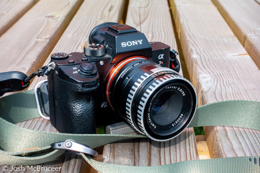
This lens was manufactured in 1967 by Carl Zeiss Jena and is a Zeiss Tessar design. The original Tessar was patented in 1902 which I have previously discussed, but this one was redesigned for smaller formats using the latest glasses and design techniques. It was sometimes called the eagle eye because of its centre sharpness and contrast. This is a 4 element/3 group design that performed well, especially when coating technology was in its infancy when it was important to minimise the number of glass-air interfaces to reduce flaring. This example is single-coated, has a minimum focus distance of 0.35m, uses unit focusing (the whole optical unit moves back and forth to focus), and was designed for use with 135 (35mm) film probably for colour and black and white – which were both available when this lens was manufactured. Films available in 1967 were very different to the ones available now and in the ’90s. They were slower and had more grain, Kodachrome II (I believe the most common colour film available in 1967) was available in ASA 25 and Kodachrome-X had just been released in 1962 with a speed of ASA 64. ASA speed is basically the same as ISO speed – in fact, ASA and ISO are just standard agencies (American Standards Agency and ISO kind of means International Standards Organisation, although it now isn’t an acronym and is just ISO, the Greek prefix for same) which specify how the film speed should be measured, there are ISO standards for bolts, paper sizes, and almost anything else you can think of (including how to make a cup of tea).
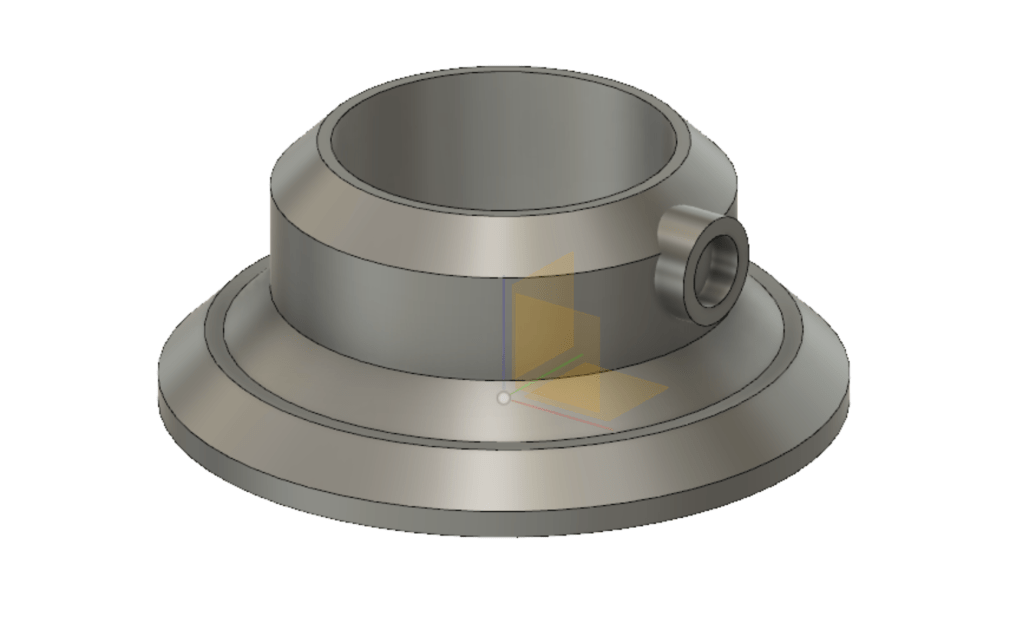
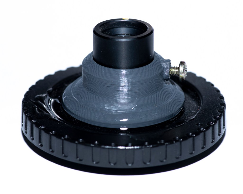
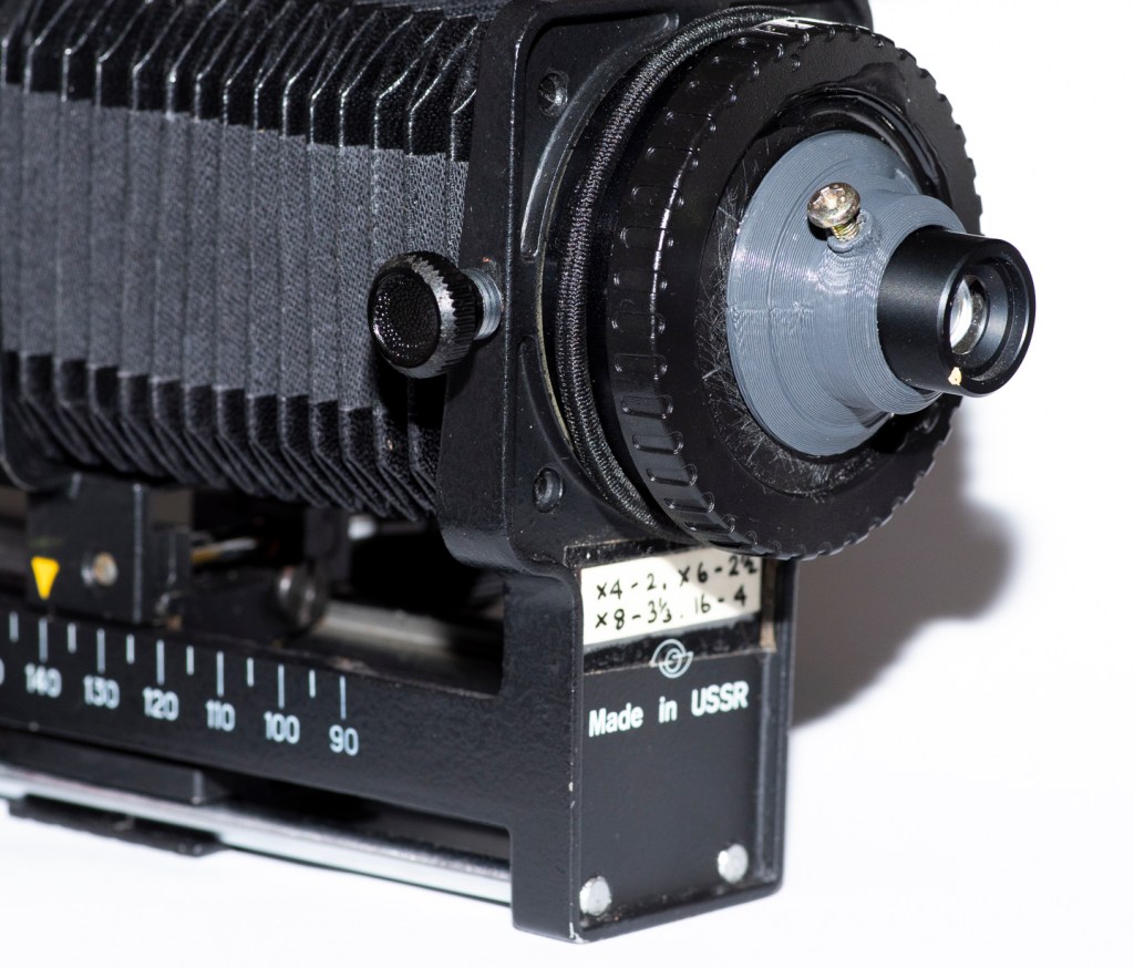
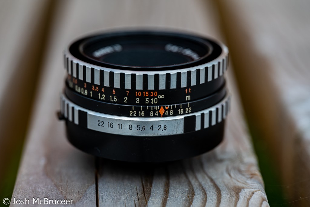
The lens has a five-bladed aperture, aperture clicks from f/2.8-f/22 with half stops. It has a depth of field scale, infrared focus mark, and an automatic aperture system – meaning that, on a compatible SLR, the aperture remains open for focusing and then stops down the specified setting when the shutter is depressed. It uses the M42 mount which is easily adapted to other systems due to its long back focal distance. The lens body is made of aluminium and has an attractive brushed/striped design that offers excellent grip. This particular lens had a stuck focusing helicoid, so I removed the old grease using lighter fluid, lint-free paper, and cotton buds and re-greased it with modern molybdenum grease (Liqui Moly LM47).
I wrote some software (this actually took ages) and printed off some test charts to work out exactly what my vintage Zeiss Tessar 50mm 2.8 lens is doing to my images.
Analysing the Blurring
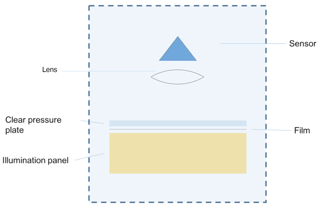
I photographed the test charts at a set distance (0.6m) wide open (f/2.8) and stopped down (f/8). The camera was set on a stable tripod and carefully aligned so that it was perpendicular to the floor where the test chart was placed a 10-second shutter delay was used to reduce camera shake and the camera was set at its base sensitivity to minimise noise.
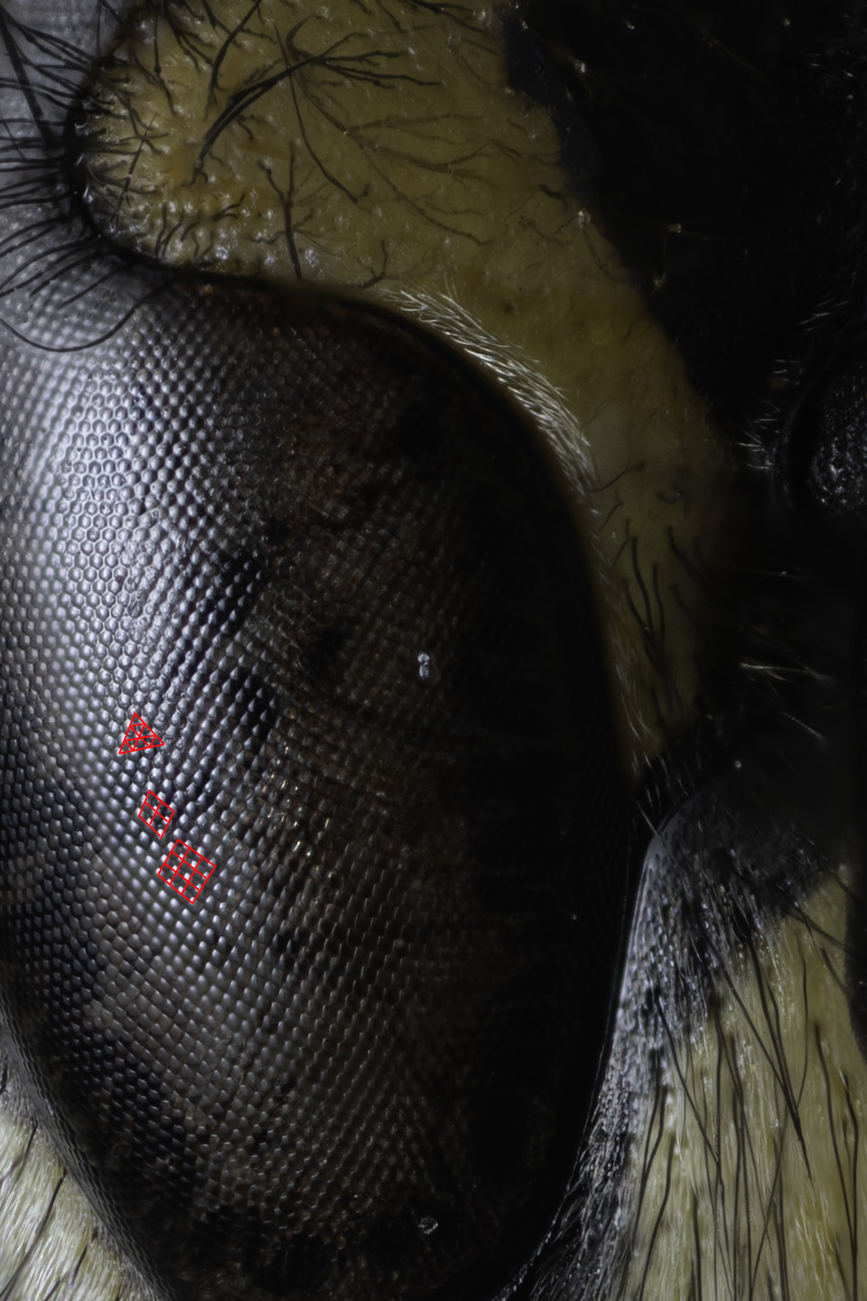
The software that I wrote found each of the test targets in the stopped-down image and found the corresponding test targets in the wide-open image, this is shown in Figure 0. I then assumed that the stopped-down image was perfect and used it as a reference to compare the wide-open image.

Using some fancy maths (called a Fourier transform) you can work out how to transform between the sharp stopped-down image and the blurred wide-open image. I did this for each target on my test chart because the amount and nature of the blurring are different across the frame.

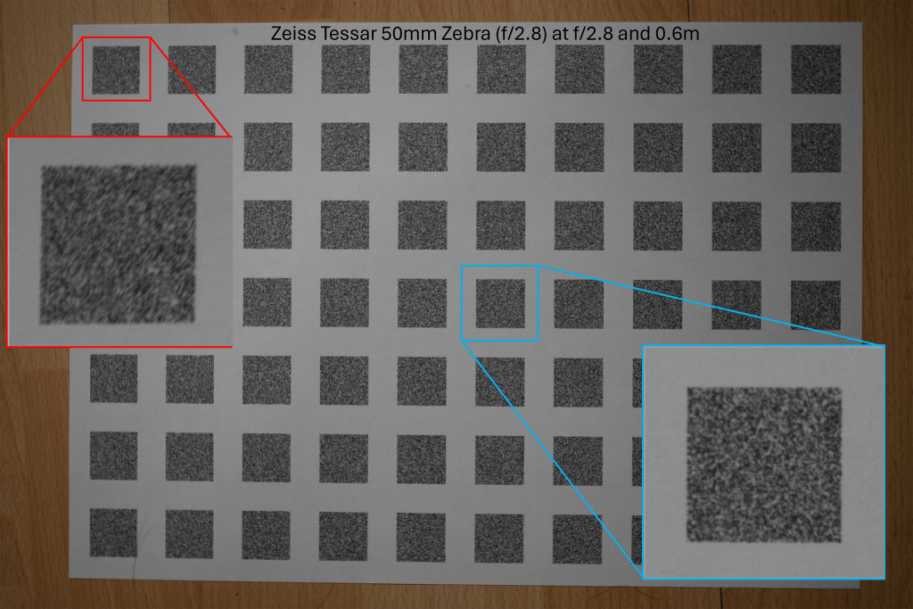
The above images are the photographs of the test charts photographed at the sharp aperture (f/8) and the blurred aperture (f/2.8). This method of using the sharpest aperture of the lens as the reference was used because it allows for perfect alignment of the images – both images have the same geometric distortion. A limitation of this method can be seen in Figure 1 in which the corners of the image are not perfectly sharp even at f/8. I was inspired to use this method after reading the excellent paper High-Quality Computational Imaging Through Simple Lenses by Heide et al, 2013, although the actual method that I used was different.

Enlarged examples of the test target pairs are shown in Figure 3. I then worked out exactly what blurring function you need to apply to the sharp image to produce the blurred image for each pair of targets. The result of this is shown in Figure 4, which is an array of point spread functions (PSFs). These PSFs show how each point in the image is blurred by the lens – the PSFs in Figure 4 are zoomed in 7x. Figure 4 also includes a second array of targets that is offset from the one shown in Figures 1 and 2, that’s why the PSFs are arranged in two grid patterns. The results from the two test charts agree.
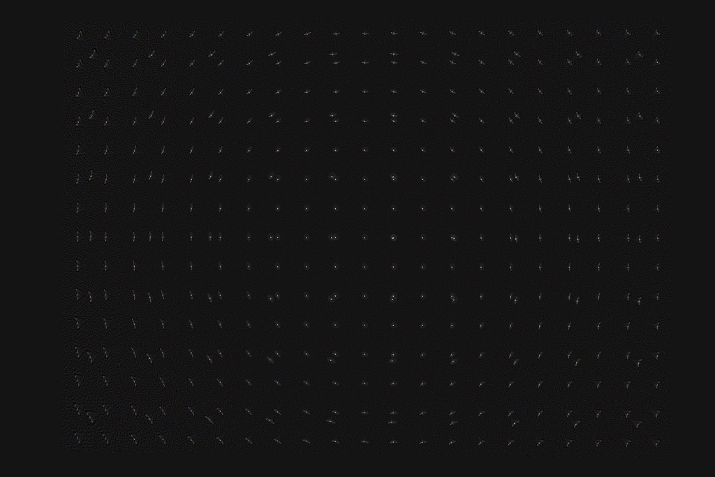


Figures 5 and 6 show enlarged PSFs from Figure 4. The nature of the PSF changes over the image. The PSFs in the centre are more compact and have a distinct halo around the central region, an ideal PSF would have a central point and no surrounding detail. The halo around the points is spherical aberration, this is an optical aberration caused when rays parallel to the optical axis of the lens are focused at different distances from the lens depending on the distance from the optical axis. This causes a glowing effect in the image, since a sharp image is formed (the sharp central core of the PSF) and a blurred image of the same object is also formed but superimposed on the sharp image. This would not greatly reduce resolution but would reduce contrast. Spherical aberration should be constant over the image frame, but varies a lot with the aperture size used in the lens, stopping the lens down reduces spherical aberration quickly.
The PSF in Figure 6 mostly shows sagittal astigmatism. Astigmatism is when rays in two perpendicular planes have different focal points. Two kinds of astigmatism that occur in systems like this are tangential astigmatism and sagittal astigmatism. Tangential astigmatism points towards the optical centre of the frame and sagittal astigmatism points perpendicular to the centre of the frame. Sagittal astigmatism can cause a swirly effect in images as it blurs points into circular arcs around the optical centre. A lens with sagittal astigmatism can be refocused to give tangential astigmatism so the orientation of the astigmatism will flip around. This is because the best sagittal focus and the best tangential focus occur in different planes. Astigmatism doesn’t occur in the centre of the frame and increases rapidly towards the edge of the frame and with increasing aperture size. This aberration is sometimes called coma which is a similar but distinct aberration that looks a bit like a comet with a sharp point pointing towards the centre of the image and a fatter tail pointing away.
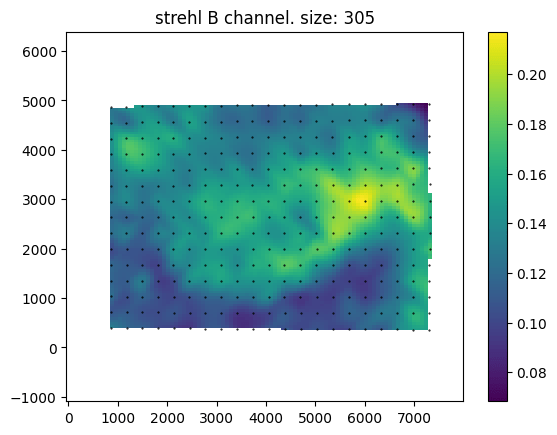


Above are maps of the Strehl ratio of the PSF. Strehl ratio is a simple measure of PSF quality, where higher values (maximum 1) indicate that the PSF is most similar to an ideal PSF e.g., a single point in this case. The bright greens are the regions of highest sharpness and the dark blues are the regions of lower sharpness. There is likely some noise in this estimate – I don’t completely trust it. However, from this analysis, it seems that the lens is somewhat decentred, as the sharpest region of the lens is not in the direct centre. This could be due to manufacturing defects such as the lens elements not being correctly seated, or due to damage that occurred during the previous 57 years, or due to an alignment issue with the lens adapter or the target was photographed.
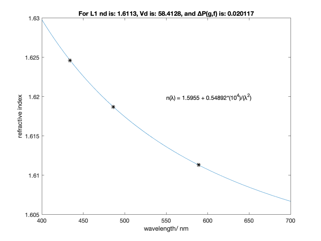
An interesting feature of this lens is the apparent lack of axial chromatic aberration. The PSFs are very similar in each colour channel and the Strehl maps are also very similar, these tests are not very demanding and are not able to test at all for transverse chromatic aberration. For a lens likely designed with black and white photography in mind this is a pleasant supprise.
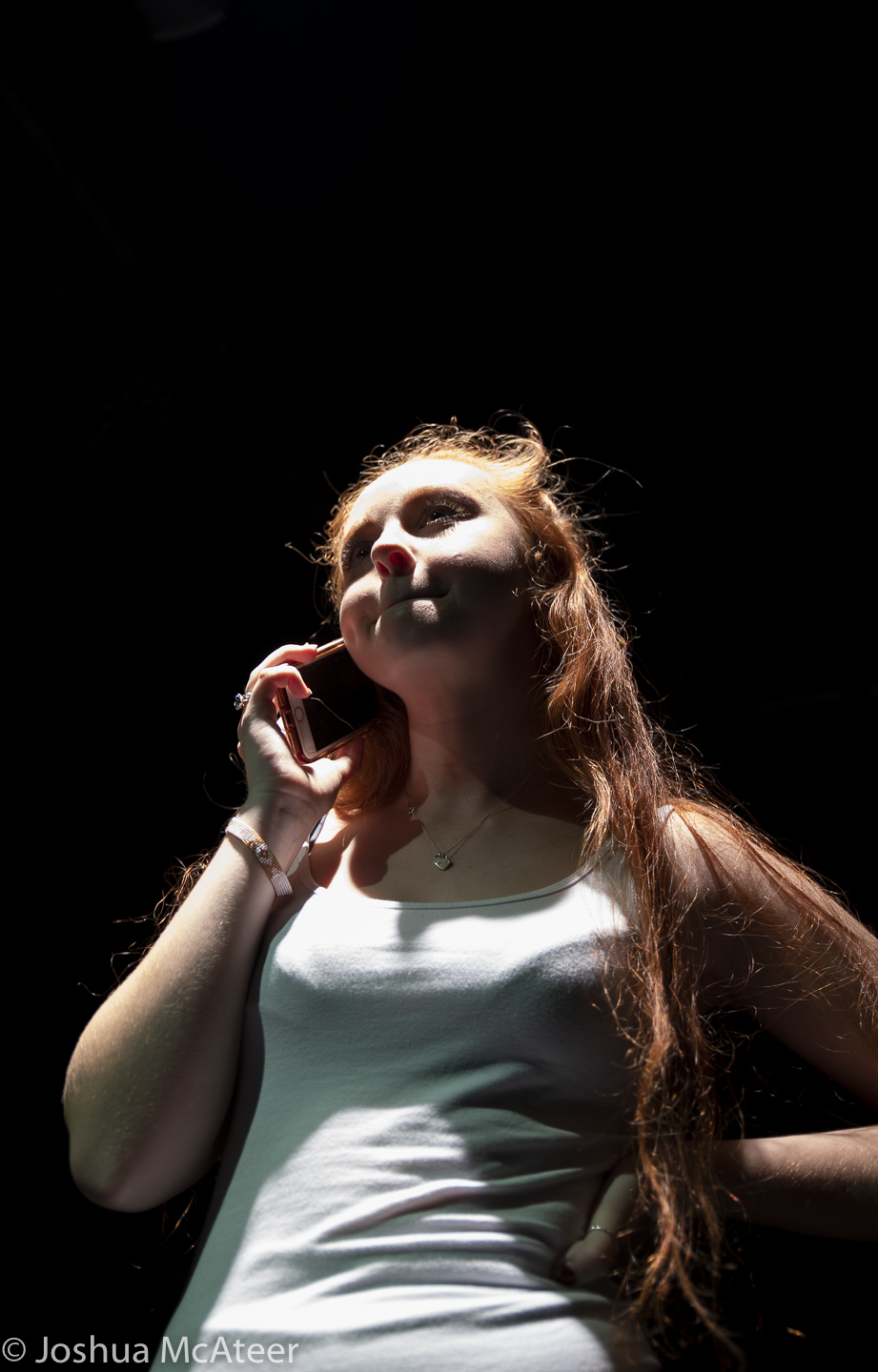
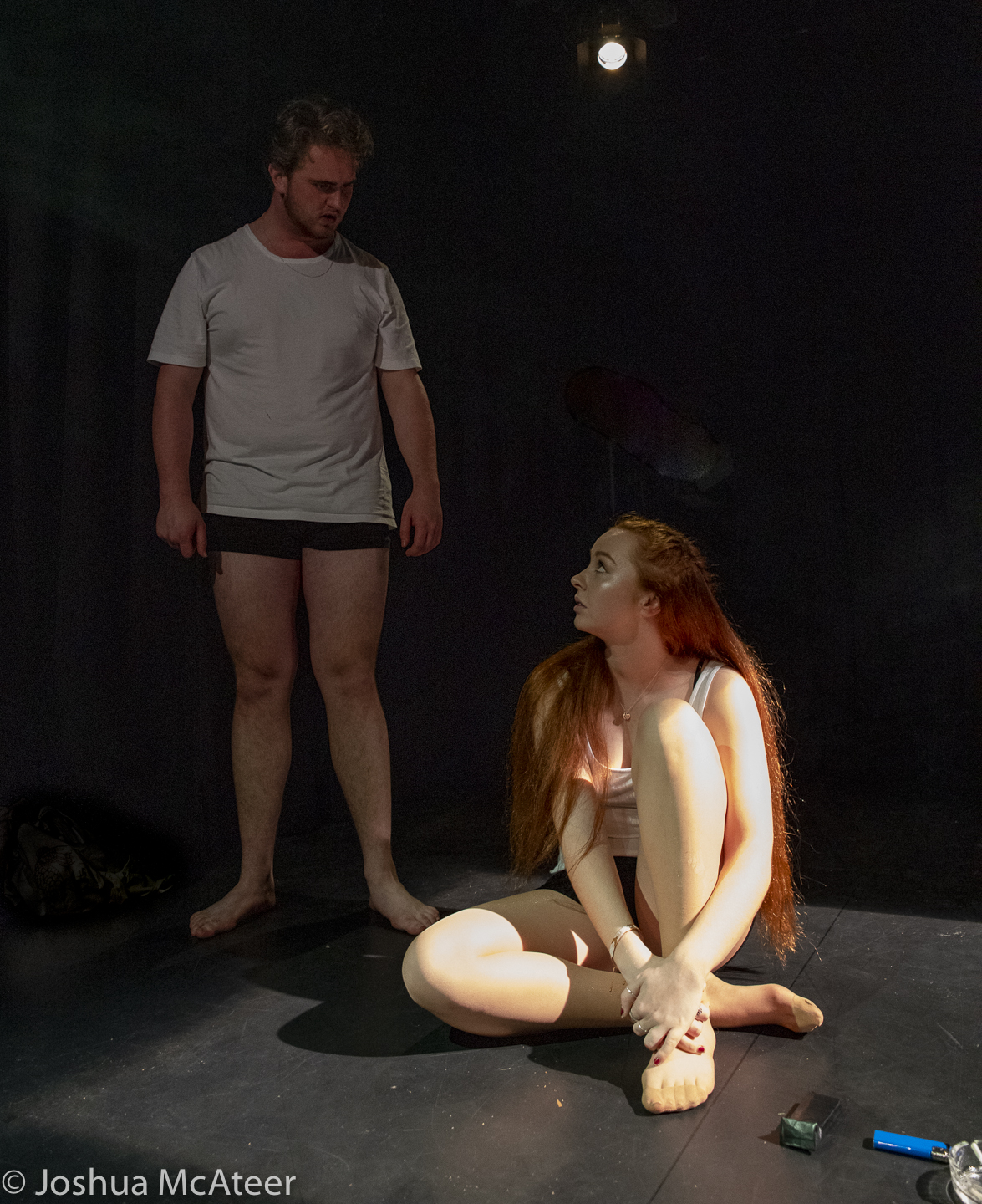
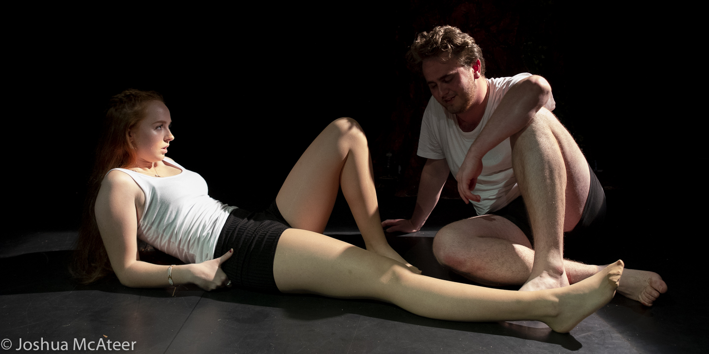
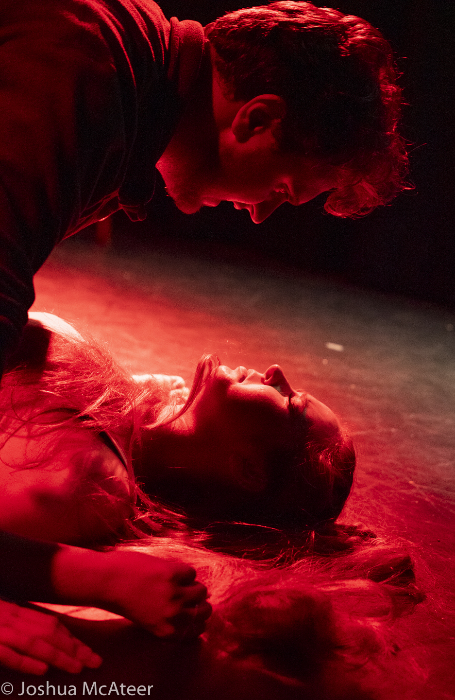
Example Images
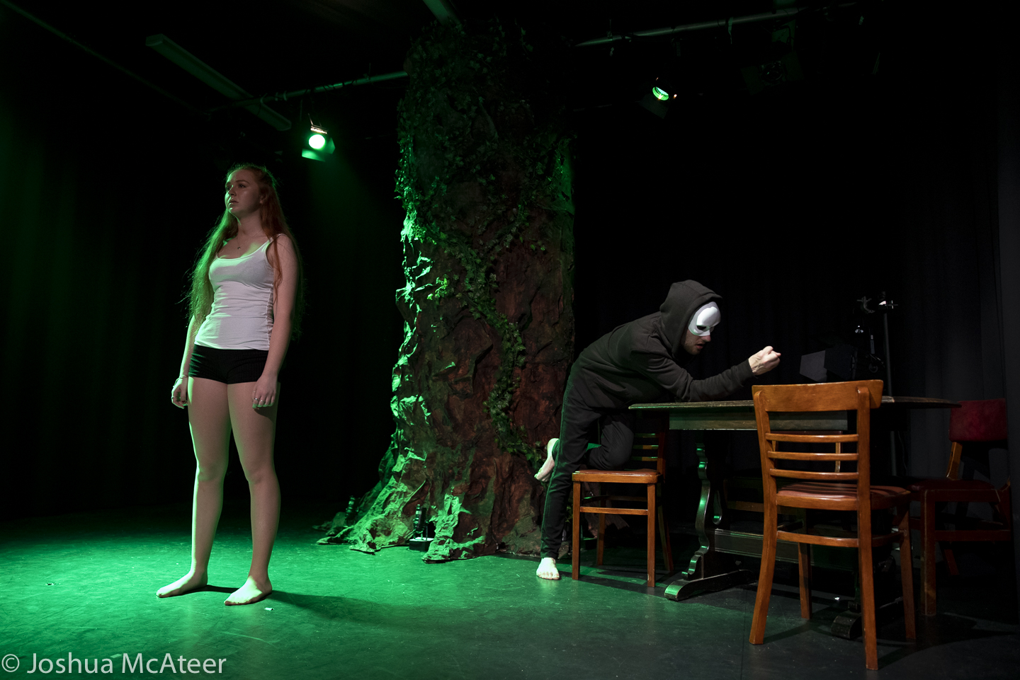
Below are sample images taken with the lens at various apertures, mostly f2.8 (wide-open) and f/8. The second gallery includes zoomed-in regions to show the character of the lens in more detail. Simple colour and exposure correction was applied in Adobe Lightroom, no texture, clarity, or dehazing was added. Images were resized to 1600px on the long edge with sharpening for screen added at export.


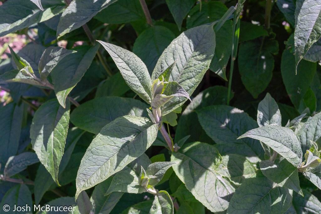
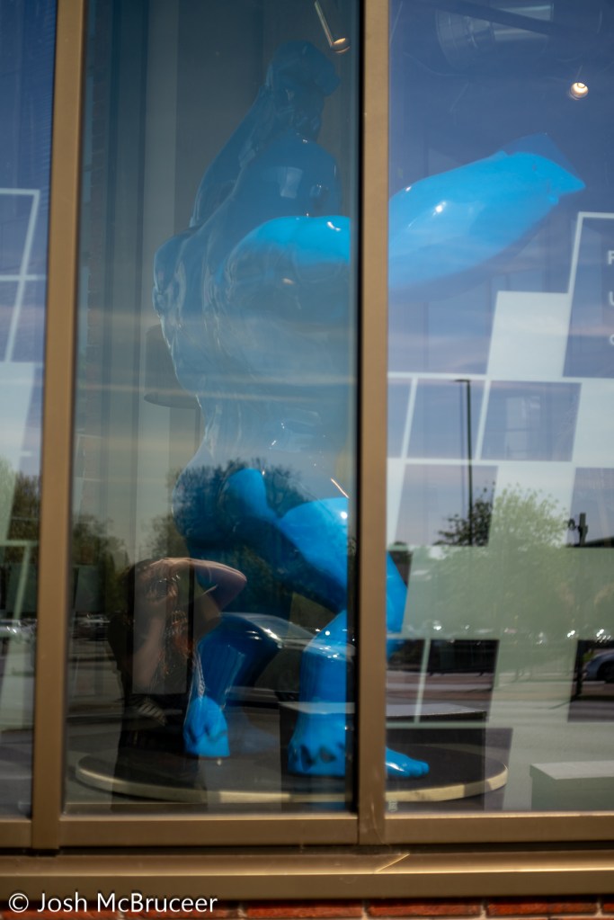


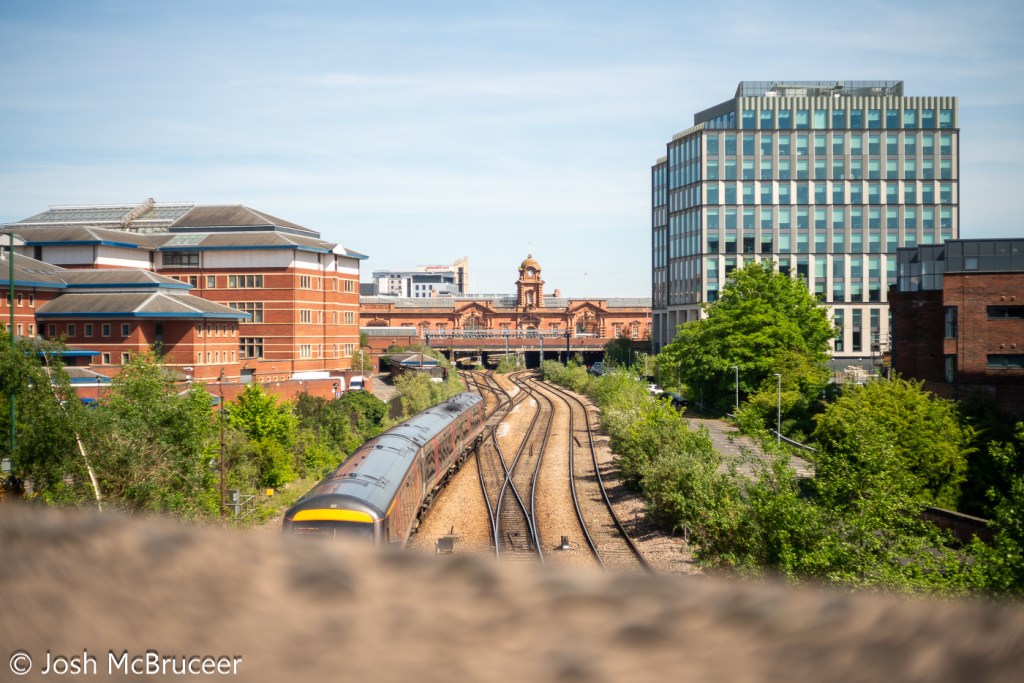


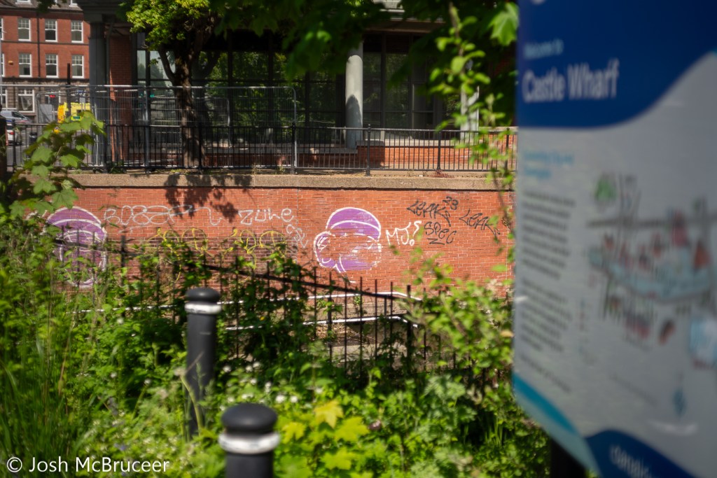


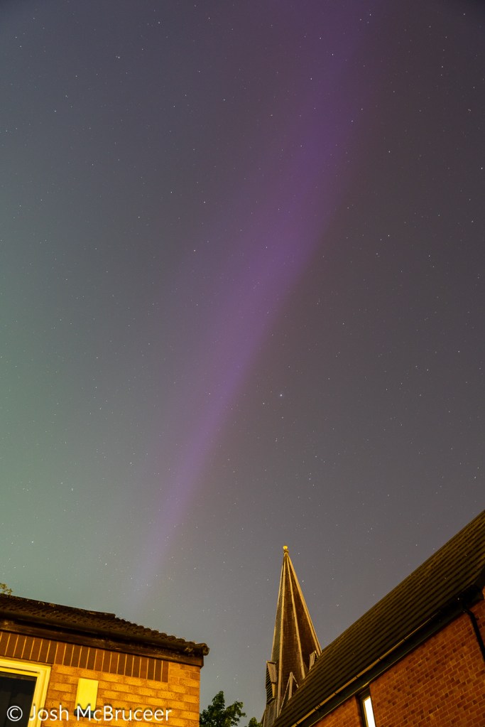
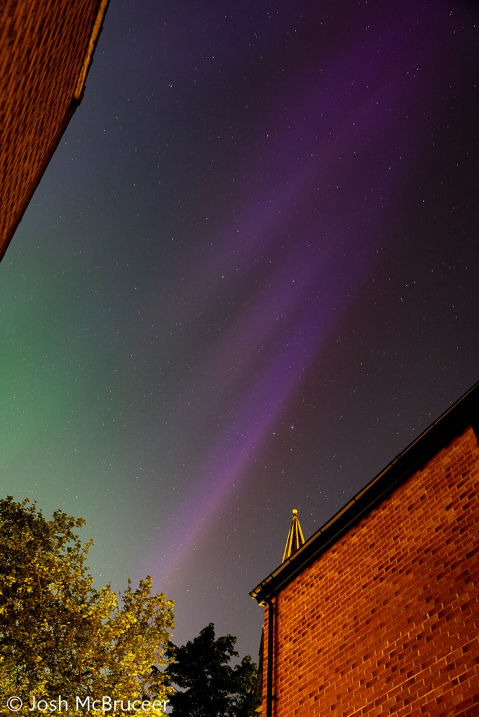
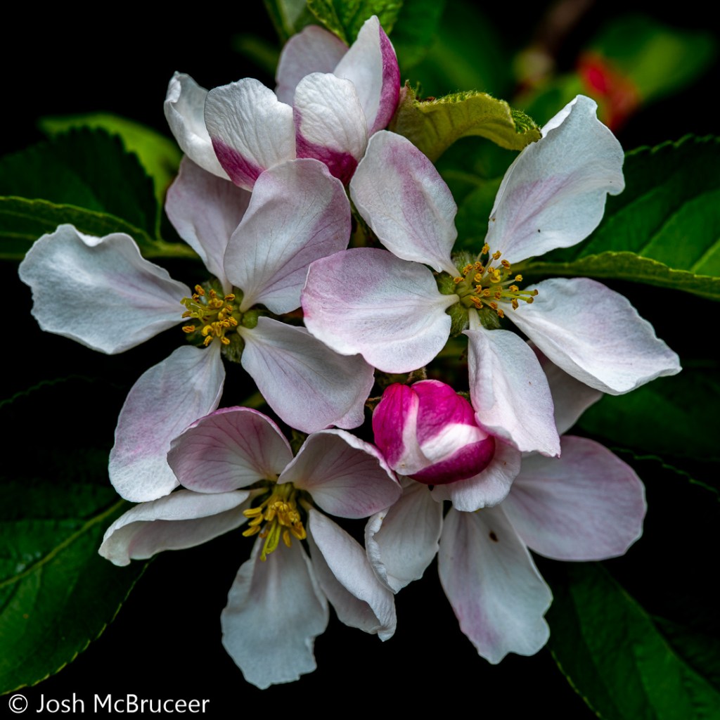
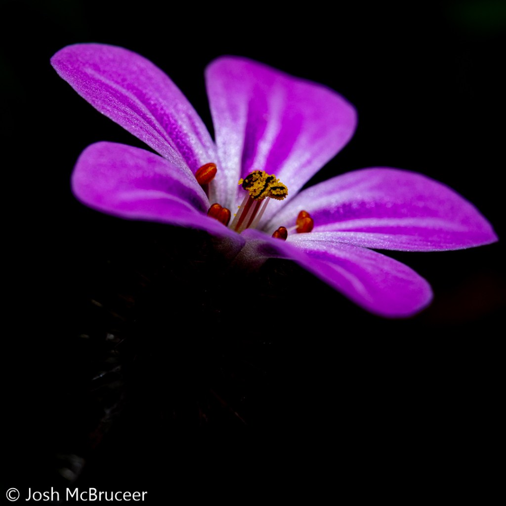
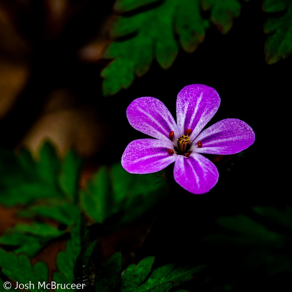
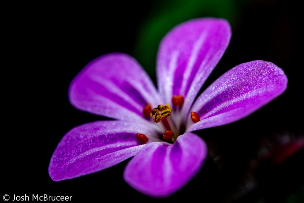
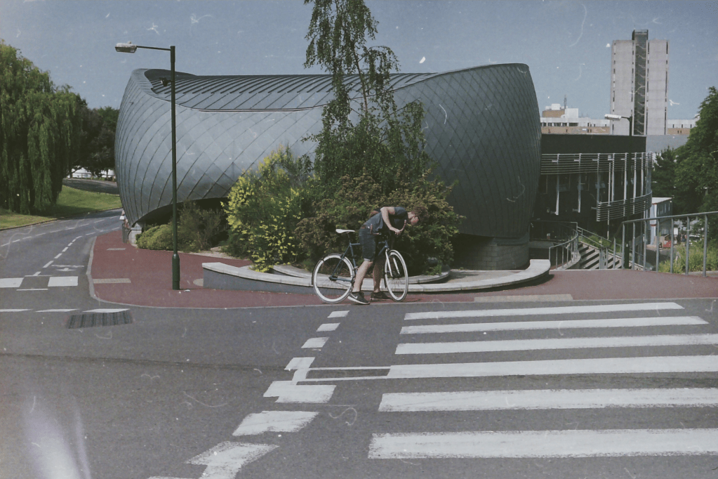
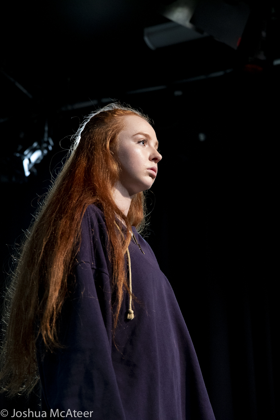
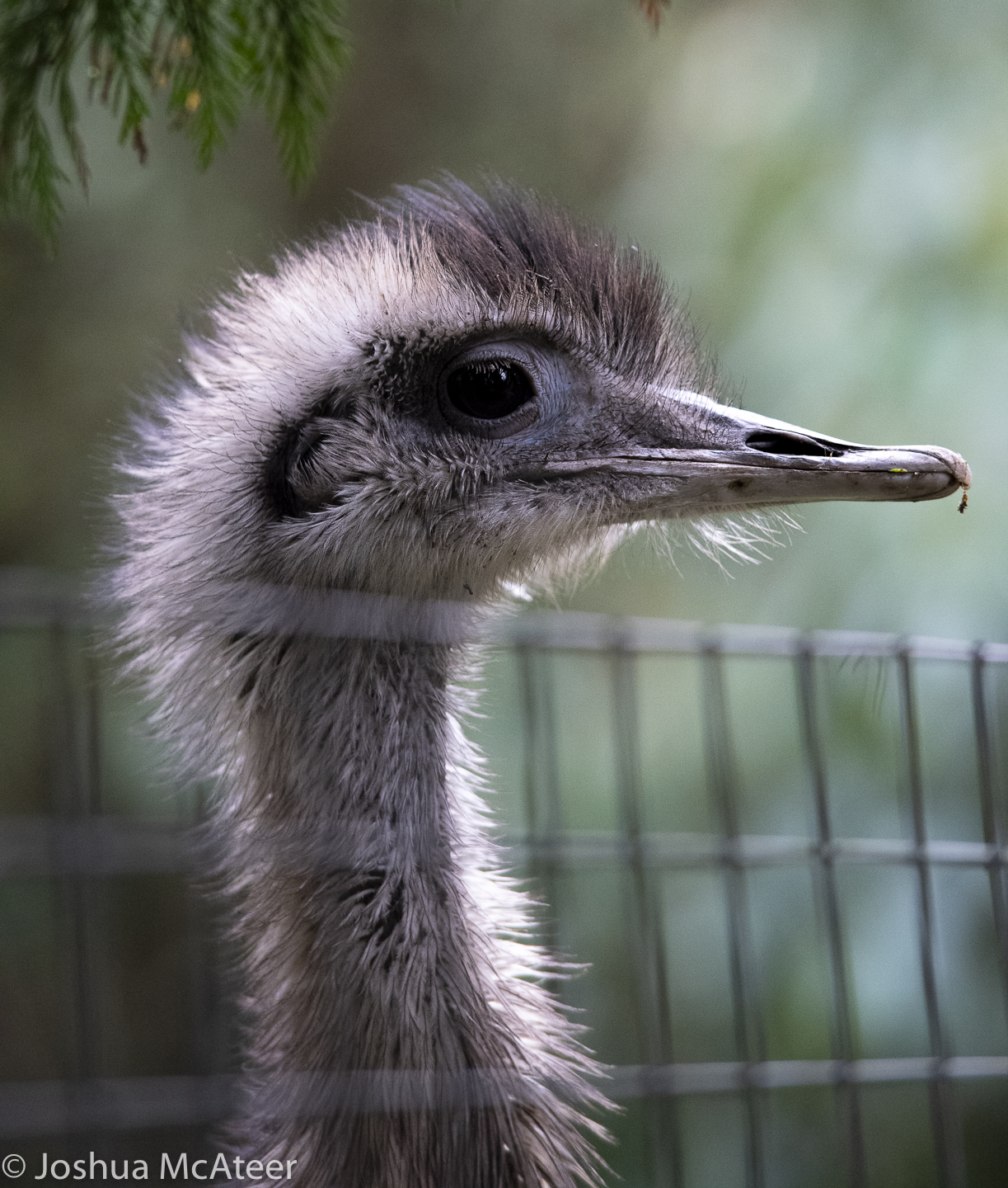
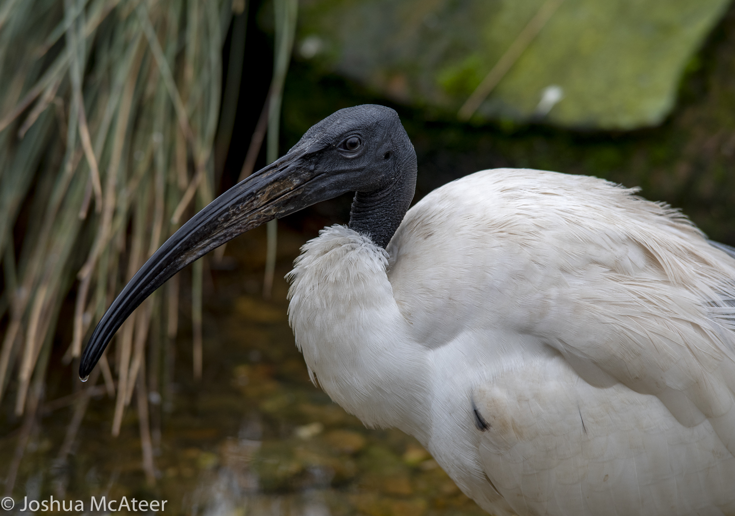
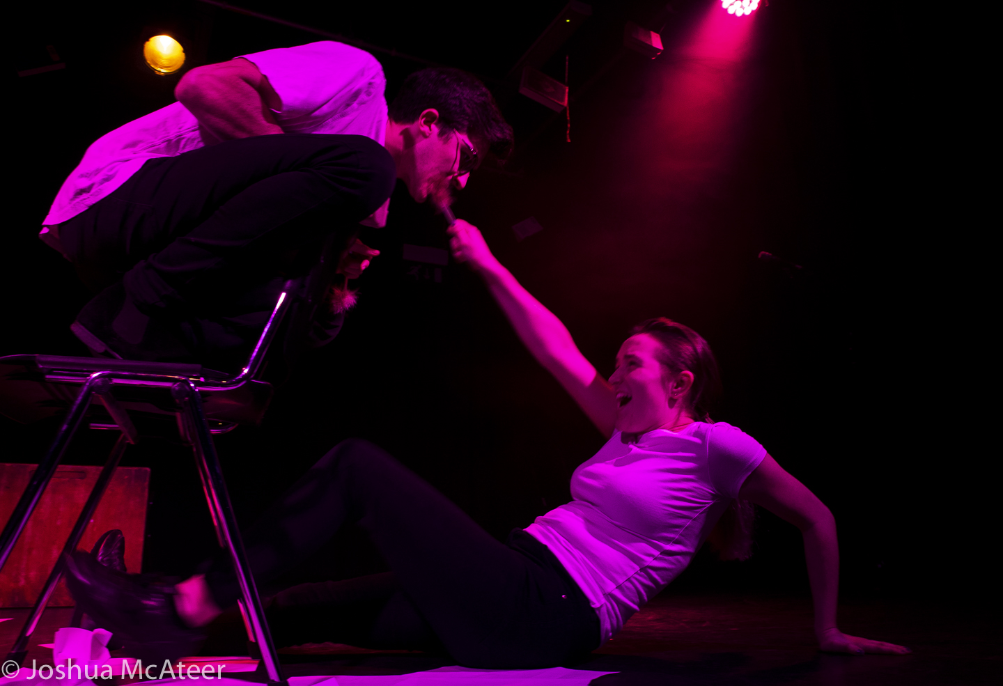
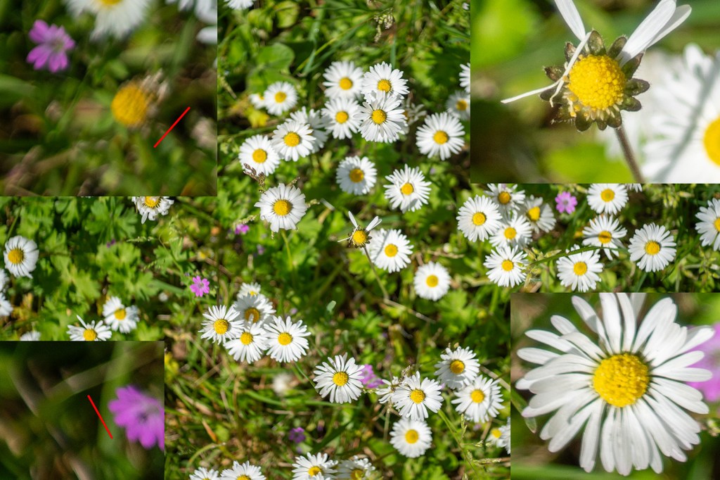
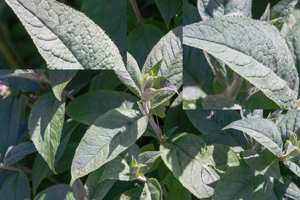
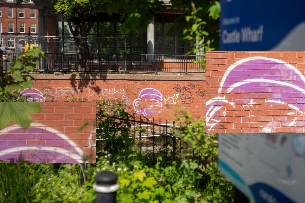
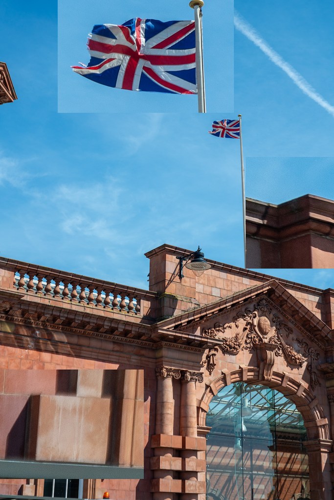
A selected sample of images with zoomed-in regions. The image with daisies shows much greater sharpness in the centre of the image compared with the edge and some swirling effect caused by the astigmatism in the lens. The pair of images of the graffiti rabbit (f/2.8 and f/8) show the increase in contrast and sharpness as the lens is stopped down. All areas of the image show an improvement in sharpness and contrast, but the edges improve more. This is also shown in the pair of leaf images, however, the increase in depth of field in these images makes it harder to determine sharpness changes in the plane of focus. The train track images show the same trend with a distinct increase in contrast in the centre of the image (the clocktower).
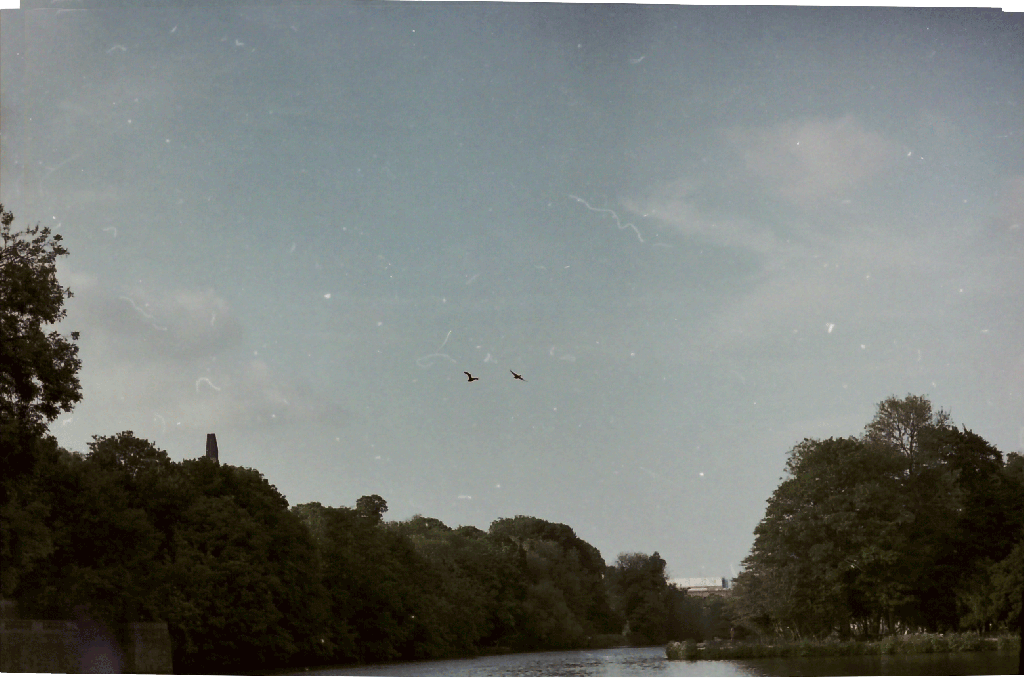
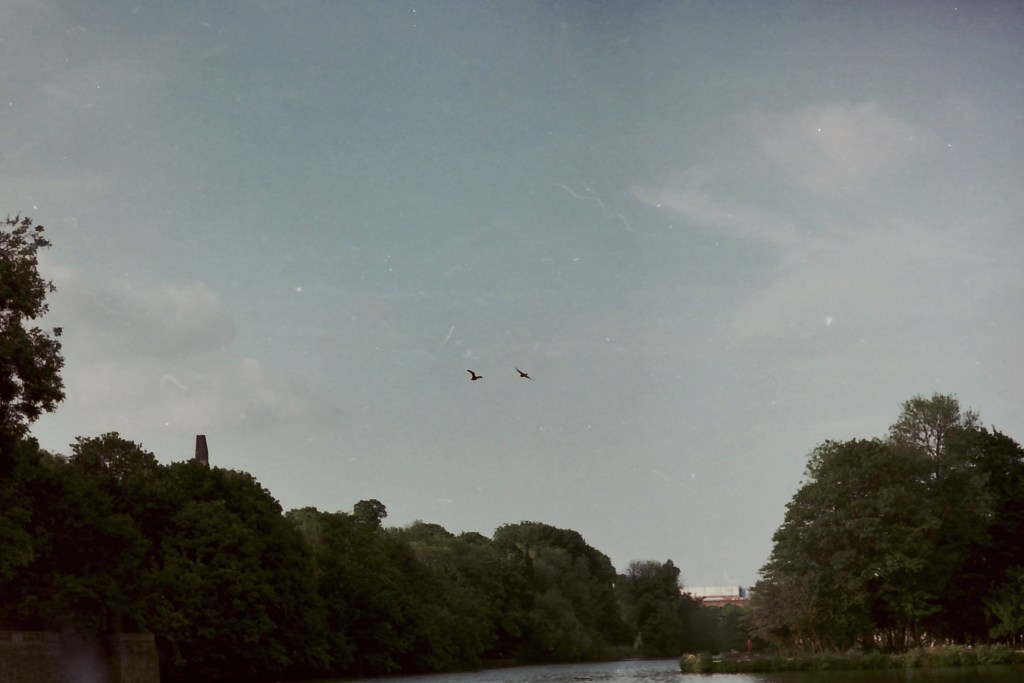
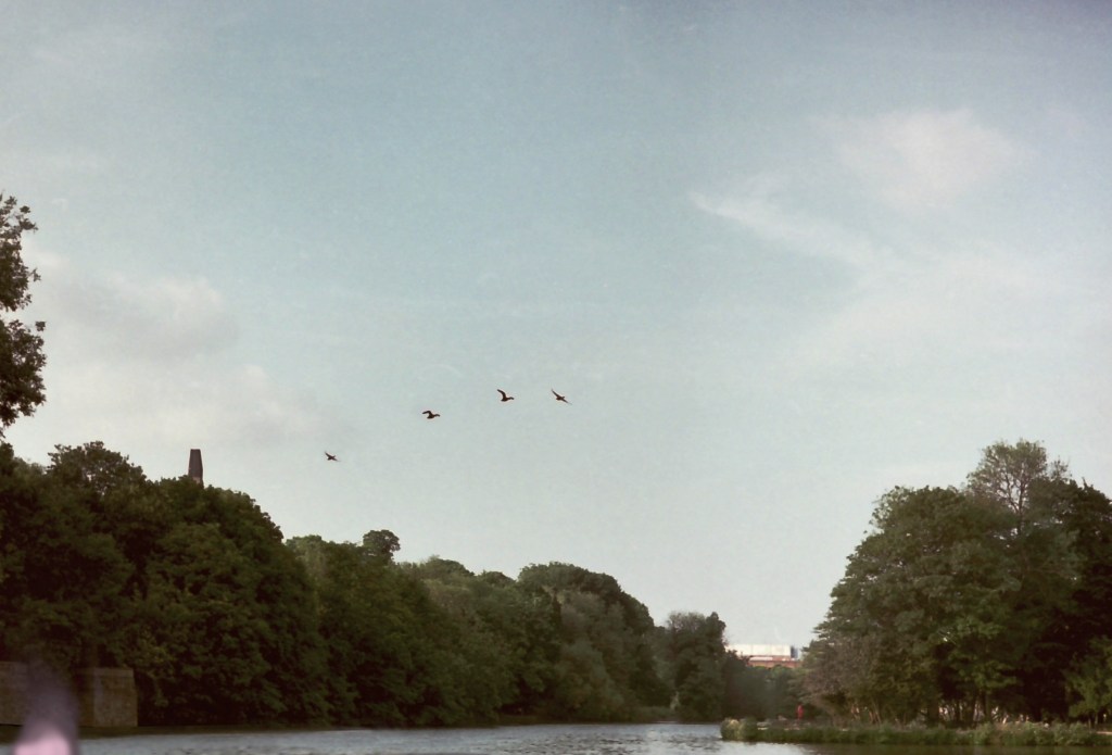
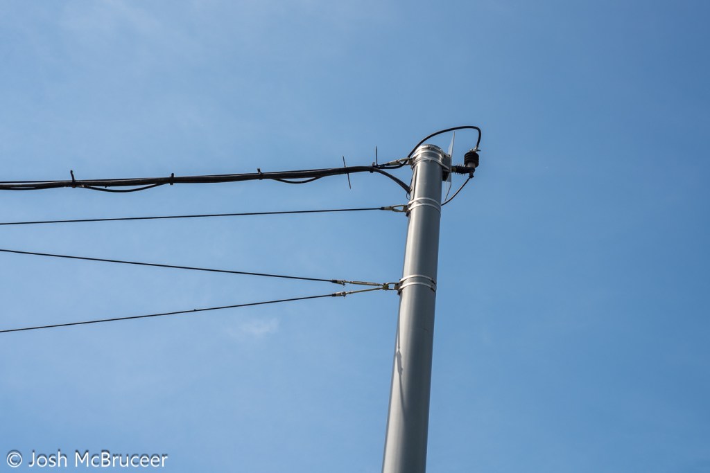
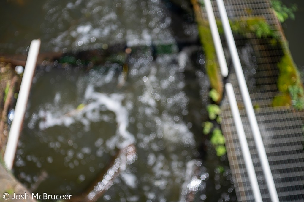
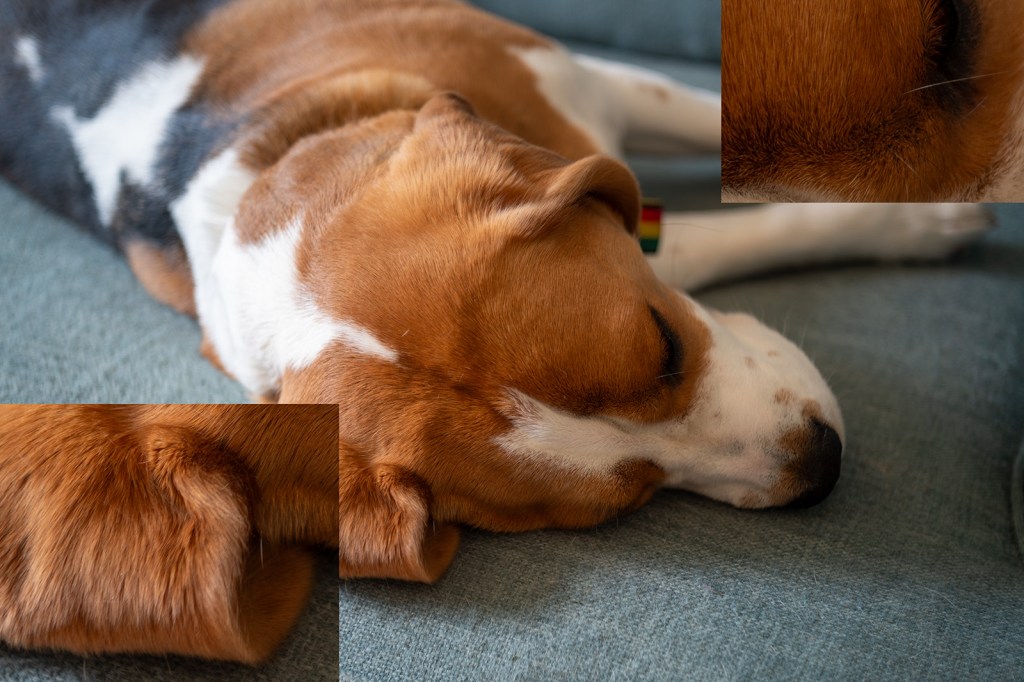
The bokeh image is of running water in a canal and was taken with the lens set to close focus at f/2.8. The bokeh is bubbly with distinct outer highlights which indicates over-corrected spherical aberration, sometimes this is considered attractive such as in the Meyer Optik Goerlitz Trioplan lens, however, the effect is less strong in this Tessar. This also leads to the distracting out-of-focus elements in the last image of the dog (my beagle, Saturn) where a line out of the plane of focus is blurred into a sharply defined feature.
None of these images show chromatic aberration, this would likely be apparent on the image of the tram powerlines.


Conclusion
Despite the lens being 57 years old it is still capable of producing sharp images. The lens is sharper in the centre of the frame than at the edge and the edge has a small amount of swirl effect. The lens doesn’t offer much ‘character’, which is likely expected as it was a standard lens for decades and most people want low-cost, small, sharp-enough lenses that don’t detract from the subjects being photographed. There some pleasant aspects of the lens, such as the slightly soft look that may be pleasing for some portrait work, and the bubbly bokeh may be desirable for some creative effects.
To get the most character from this lens, have a bit of separation between the subject and the background and foreground elements. Strong highlights may have a distracting or exciting bubbly effect, so stay cognisant of this. The lens has a great minimum focusing distance and so can produce quite a lot of out-of-focus blurring, it’s also a bit softer up close, so use this when you want to knock out very sharp details, such as skin texture in portraits. The lens has little chromatic aberration so don’t worry too much about that. The vibes of the lens tie the image together nicely, although they make it a little flat before contrast is added back in editing.